Design.
The design phase of the Torch Project, where research turns into form. Across three weeks I move from loose sketching and early concept development through ergonomics, user interaction, and reflections on sustainability and ethics, developing a torch that is both visually compelling and functionally meaningful.
Discovery Demographic Distillation
Elderly
I found out of the 4 choices given, teens, 20's, middle age, and elderly, I really resonated with elderly mainly because of the scenarios I felt I could create and also my strong connection with this demographic. Firstly I don't strongly connect/love designing things for kids, as that aesthetic and lifestyle I dislike and don't communicate well with. Teen was another strong contender for me to focus on as I am currently experiencing / experienced that lifestyle and can use my own lifestyle to back up my design choices. Middle age just felt a bit broad to me as it's a long period and so many people in that demographic experience totally different things, they could have children, live alone, live with parents, live in apartments, live in a car, it's just too broad to narrow down. In the end Elderly felt resonating to me as they are knowledgeable and have experience with this tool over many decades so it will be a good way to get information that's at a good quality.
Torch Use Scenario
These scenarios are real-life examples, gathered from four individual people who genuinely fit the elderly demographic. Rather than guessing at how this group uses a torch, I collected first-hand accounts of when and why they actually reach for one, then grouped them into the categories below.
General life
- A small light, not too bright, to help guide you to the bathroom at night time
- Dead simple, only an on/off switch, as it's meant to be purely functional and not aesthetic, since you don't even look at the torch because you're in the dark
- Power outages, to help navigate when all the lights go out (before resorting to candles)
- Seeing into dark, hard-to-reach spots, under the car dash, behind the washing machine, or the back of a cupboard
- Reaching for the phone's light but finding it isn't bright enough, so a proper torch is preferred
- Needing hands free, up in the ceiling or in awkward spots, where a head torch beats holding a torch
- A small push-button torch kept in the bedside cupboard, handy and bright
- Small torches for when the grandchildren sleep over, so there's light if anyone wakes
- Keeping a torch in the car, just in case
- Picking up a torch when you need it and finding the batteries flat, so a USB-rechargeable one that's always ready is the preference
Outdoors / country
- A stronger torch for outside jobs, or when out in the country
- Walking to the shed or heading outside after dark, hands free with a head torch
- A dolphin torch for fishing and catching crabs on the beach at Yatala
Holiday home / camping
- Big torch to walk along the beach at night
- Big torch to walk around when in a caravan / outside in the caravan park
Reflection on
Feedback Scenarios
Notice #1 | Power
Firstly I want to point out one of the biggest flaws I noticed in the scenarios, and that was the lack of power. Most people mentioned that they either like USB-C more than battery, rechargeable, stronger LED power, not picking it up and it being flat, or it's not strong enough for really dark places.
Thinking about this ergonomic factor leads me to needing to incorporate in my design something where the light is always powered using a USB-C, therefore when you actually need the light at any time, then the light is fully powered, has a strong light due to not relying on pure battery, and ready to go at full charge and power.
Notice #2 | Indoor vs Outdoor
Indoor was most common in the responses, as it felt as if they needed the torch in an instant when a problem arose inside. Like general bathroom use, power outages, going into the attic to quickly grab something, or replacing your phone's dim built-in flash. Indoor seems to be more of an immediate problem.
When comparing to outdoor, it feels like there are already solutions to those problems, like how they mentioned they like the dolphin torch (an existing product), or have good big torches for beach walks and camping. Overall these scenarios didn't sound like a problem, but more felt like these are what they like in existing products and don't need to be redeveloped.
Overall, I do see a trend in problems for the interior realm. Mainly focusing on instant problems like blackouts, quick bathroom runs at night, or their classic torch in the drawer going flat right when they actually need it.
Notice #3 | Geographical
When originally thinking about how an elderly person would use a torch, I mainly thought about their actual home. However, many retired elderly people have holiday homes. These homes are generally more remote than the city, such as in the middle of the Australian outback, in remote towns, in coastal areas, or country residences, hence they don't have major city lighting control to light the streets and surrounding areas at night. Therefore they are more likely to use torches, and generally these torches are meant to be high powered with wide spreads to really help guide and light up the whole environment around them.
Overall
From these notices that I took importance to in the scenarios, I will be able to better my design to help eliminate these imperfections in existing design and improve the ergonomics.
Overall, the main thing I'm going to focus towards in my design is something that, for indoor use, is instantly powered when needed, has strong functional and simple characteristics / easy to access, and high power for general use but low power for bedtime use.
Week 5 Sketching & Early Concept Development
MINI Design Reflection
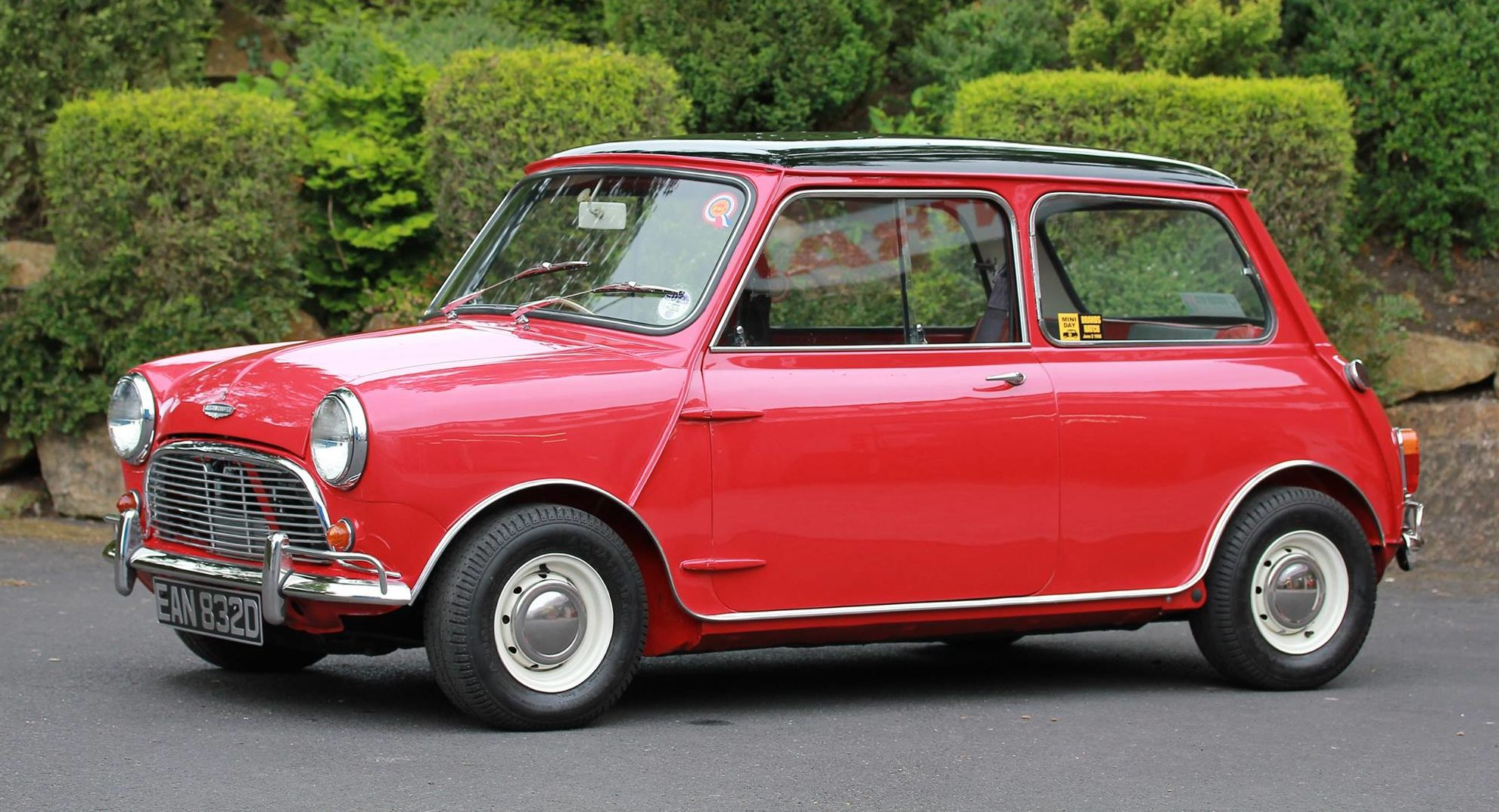
How would you describe the MINI?
I personally love innovation in design as I feel it sets designers apart in the industry and brings joy to generic design and creates diversity between customers. I describe the Mini as a major innovation, bringing large standard cars to this innovation, with great fuel consumption, compact but interior space, and small nimble dynamics. All this while improving driving and economy crisis in the time of an oil crisis when this car first released. This car isn't just built to be a car, but to also think about the problems of consumers and improving on that.
Who was it designed for?
The British economy was undergoing a large oil crisis and depression from the war, so this car directly links to the citizens of Europe, ensuring in tough times, this fuel saving, cheap to run car helps take the weight off the customers while also ensuring there's still 4 seats and drives well.
Who designed it?
Alec Issigonis, an innovator who understands the challenges of people in an economy, and develops solutions to help improve their lives while also giving them a solid and fun drive.
Muji Design Reflection
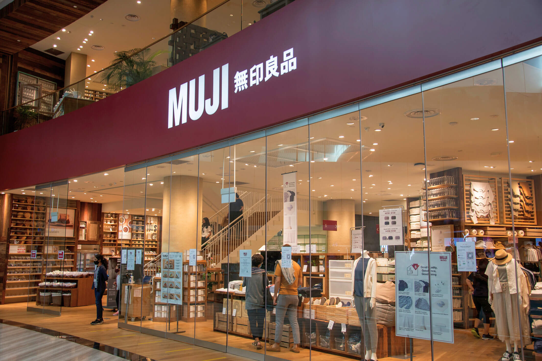
3 Key Takeaways
Simplicity is key
In a world where we have so much going on, phones, distractions, work, life, having a calming simplistic environment to live in makes people feel more relaxed. Rather than brands shoving advertising in your face in your own home, Muji eliminates that and offers an alternative, creating peace in a home.
Cheap & Quality
Removing the branding and going back to a product's simplistic roots not only allows designers to focus on the quality but also helps reduce the costs for consumers.
Consumer
Their whole design aspect is to feel luxurious and made for purpose using good, simple design. However, it doesn't come with a large price tag. Because of this, I found the design to appeal more to the consumer, transforming environments into high quality spaces that benefit middle class families and people.
Rapid Ideation Sketching
A fast, loose sketching exercise generating many idea variations to explore how form, colour, texture and symbolism communicate meaning.
Warm-Up Sketches
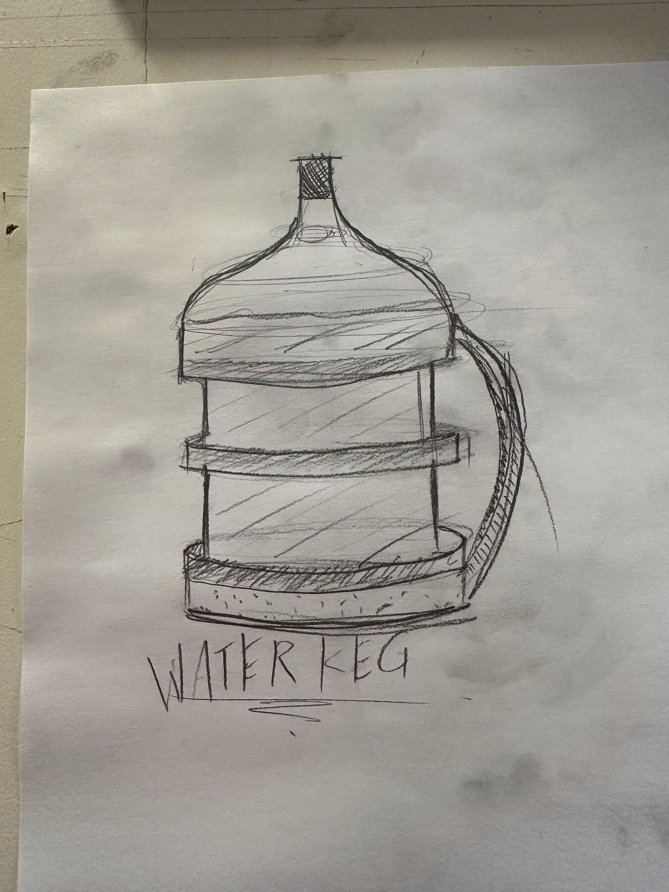
Quick Sketch 1 | Water Keg
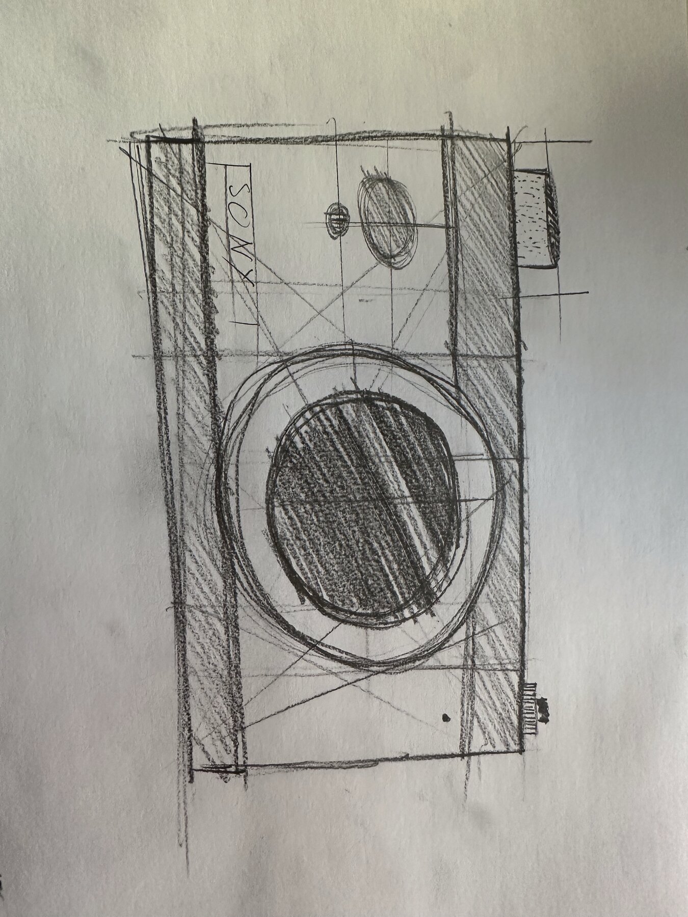
Quick Sketch 2 | Sony Camera
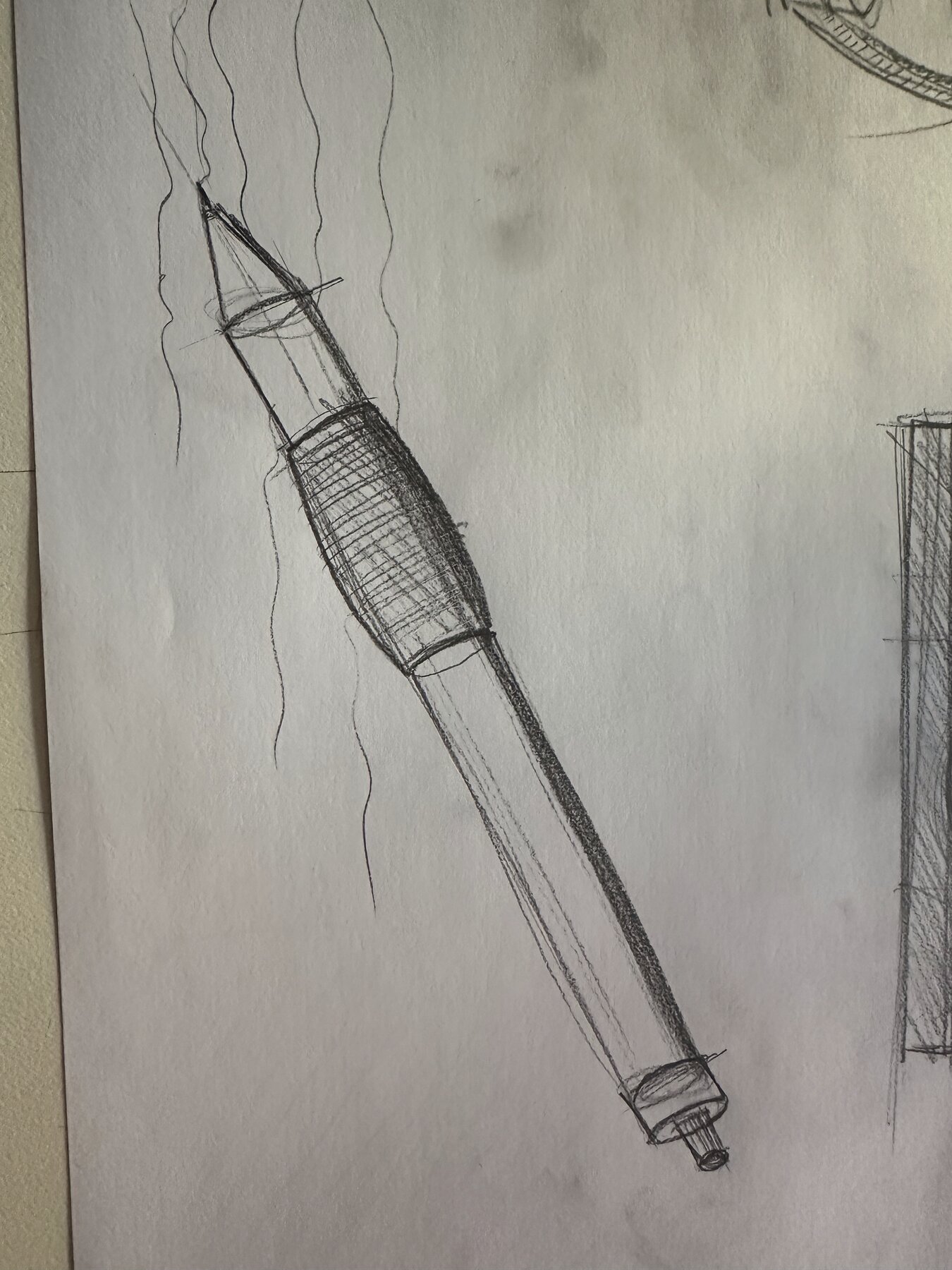
Quick Sketch 3 | Mechanical Pencil
8 Torches in 10 Minutes
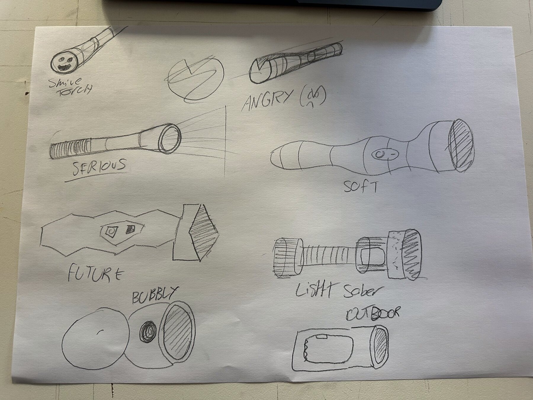
Mass Ideation
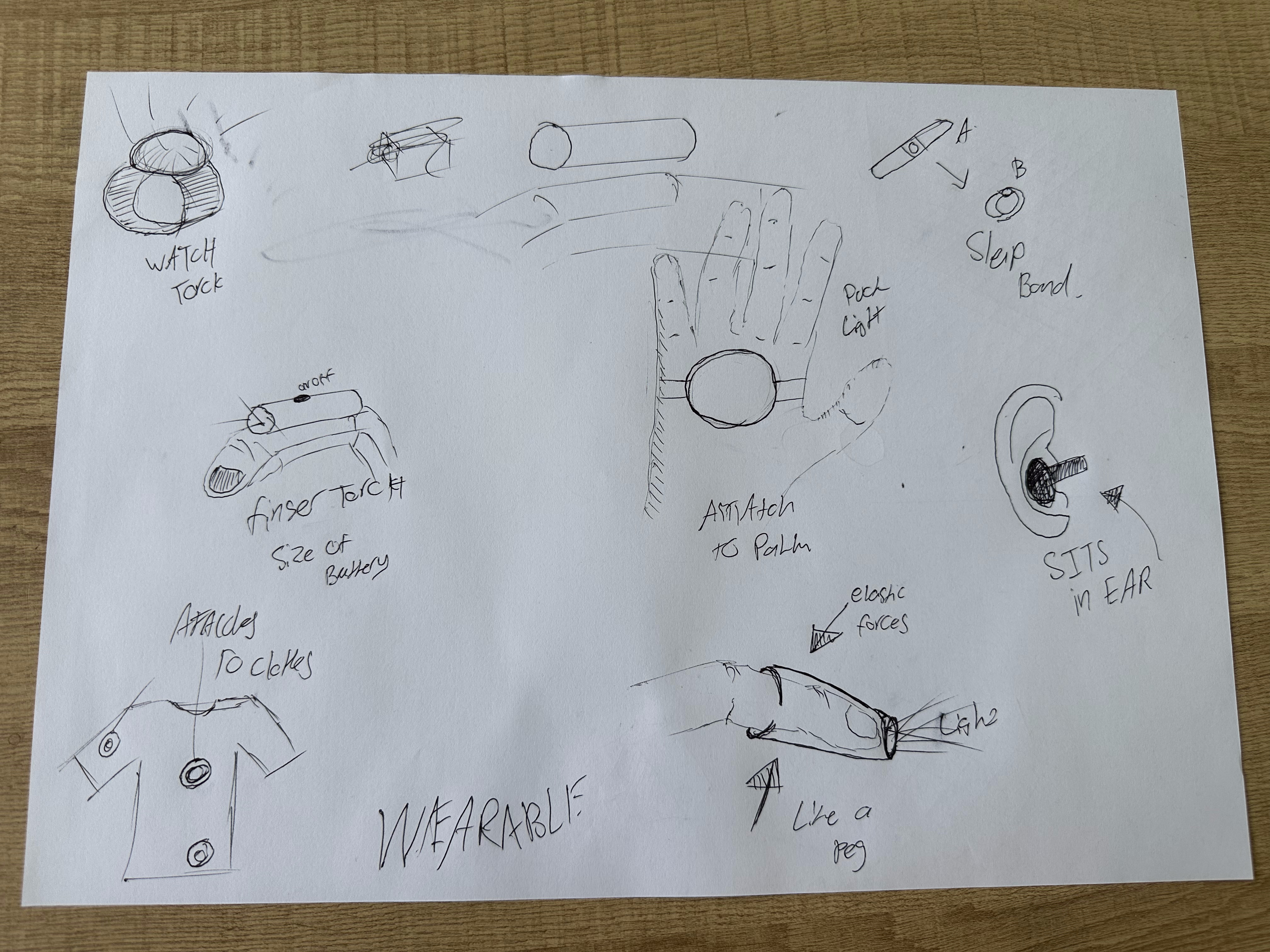
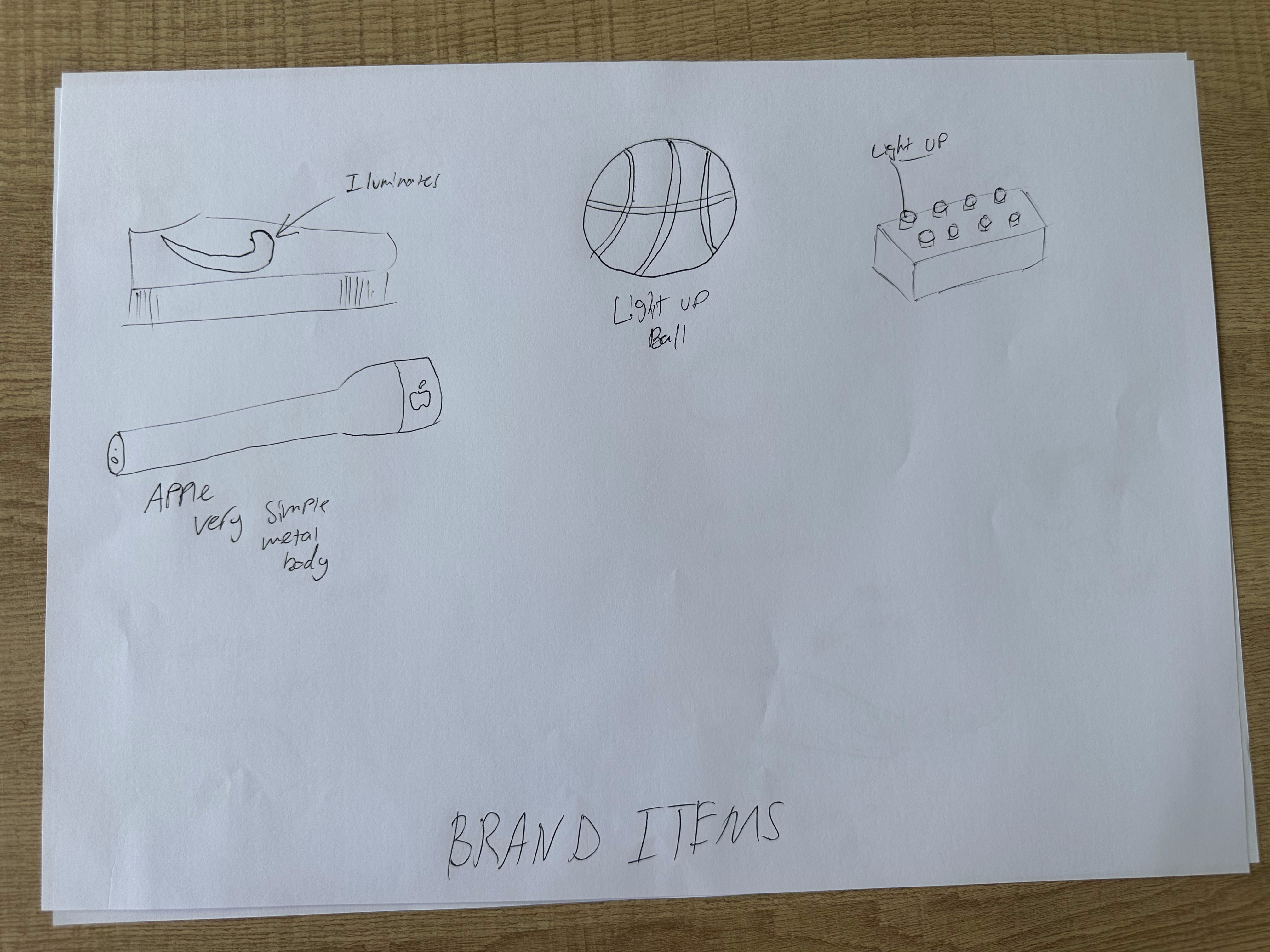
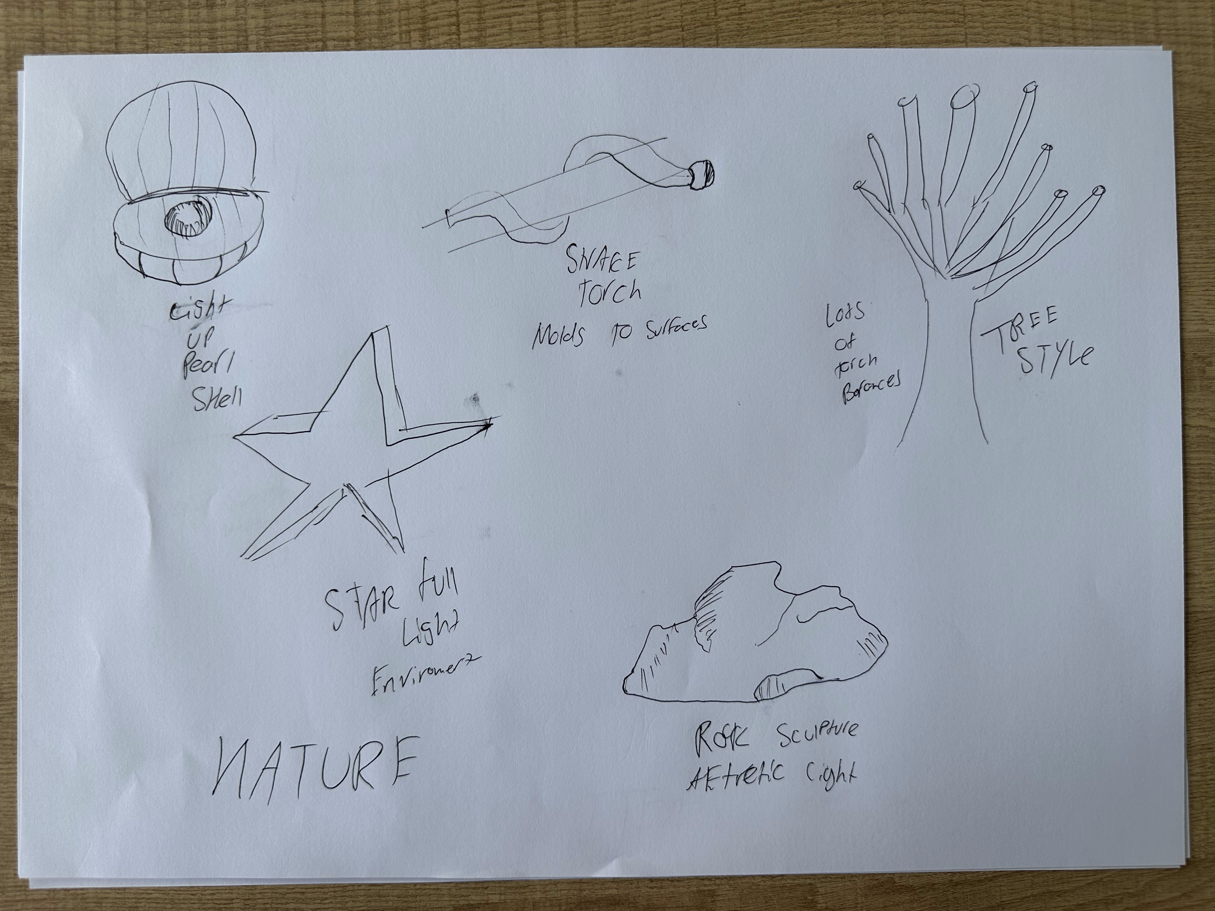
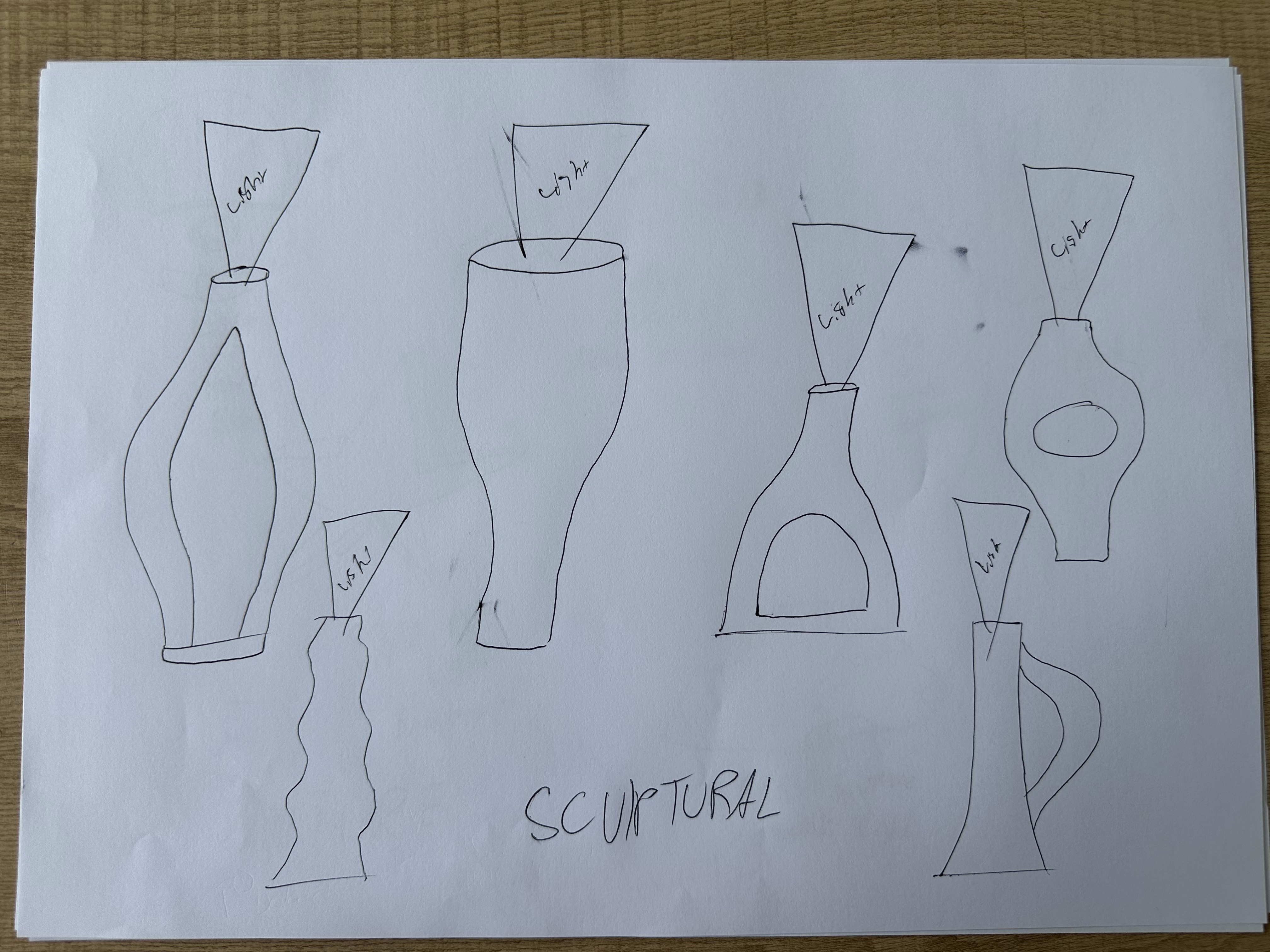
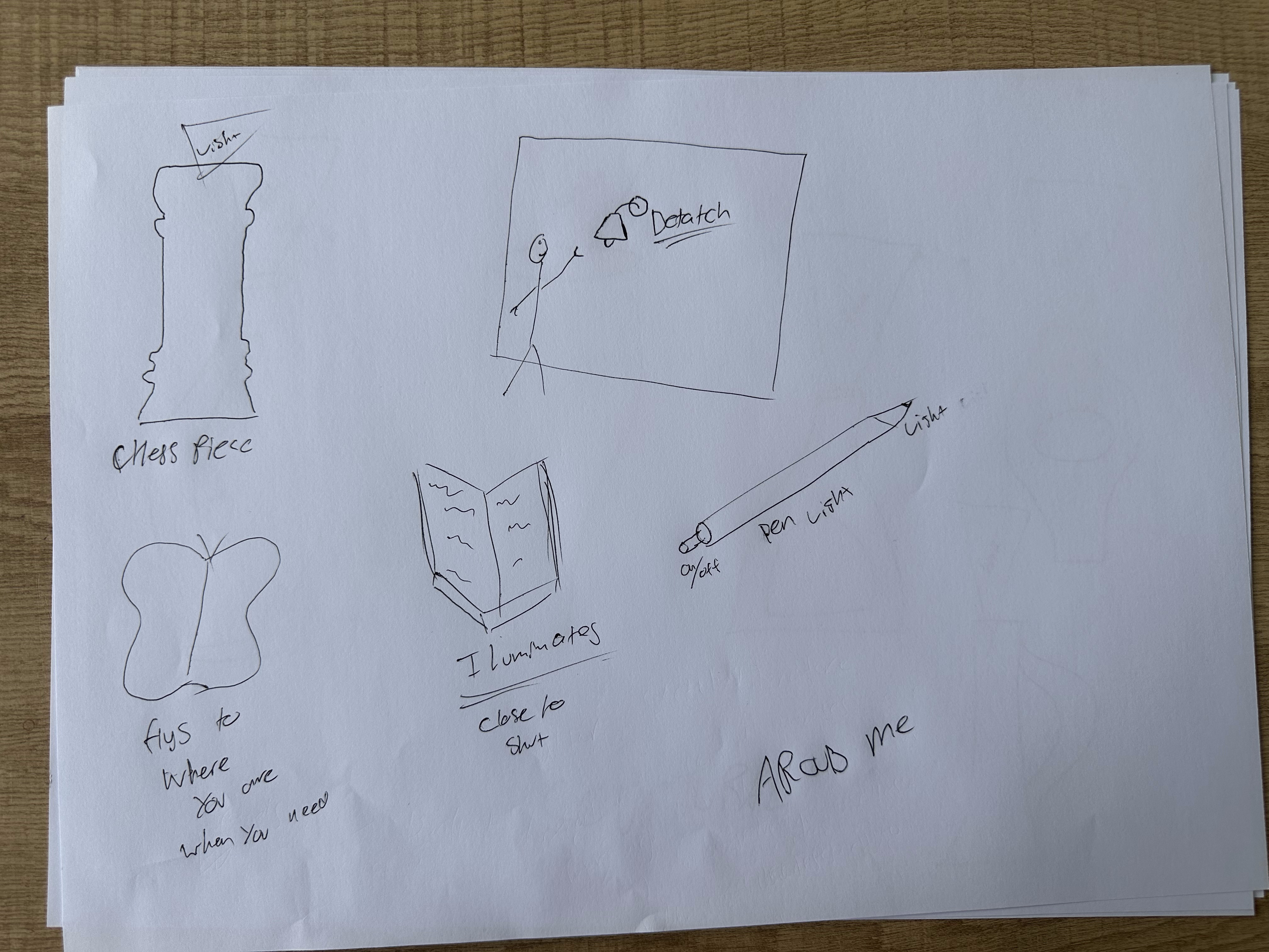
Thinking Timeline
Wearable
Started here. It really fitted the demographic, because it's easy for them to hold.
Brand Style Items
Didn't like taking existing objects, so I moved on fast.
Nature
Had cool, strong ideas here. Led into organic designs.
Sculptural
Derived from nature. Developed the idea that an art sculpture could also be functional, something you'd always know where to find.
Items Around Me
Moved to things I see in the moment, and ran with the idea that everyday objects could be a torch without anyone knowing.
Reflection
I finally came to a design realisation: I want to develop a product that exists in an environment as a decoration, and is a torch even if you wouldn't know it. This way, it's easy to access and you always know where it will be in the case of a dark emergency. This really links to my demographic, making it easier for them and eliminating the need to scavenge through drawers. Additionally, this can be an always-powered object, ready for any emergency, with a strong brightness. This combination is both aesthetic and highly functional.
Iterative Variations
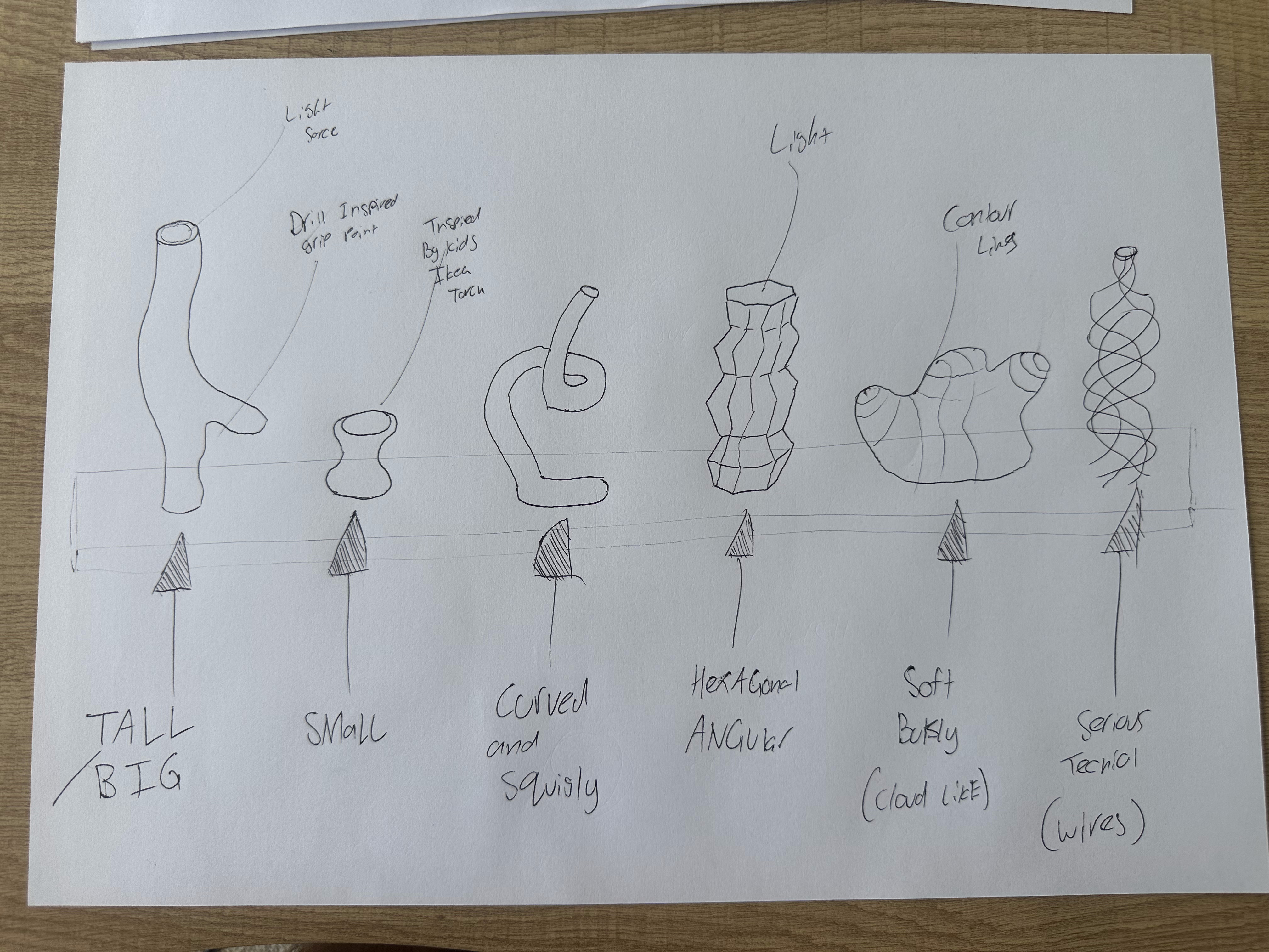
Process
Tall / big. Too large to actually hold and use.
Small. Might be hard to find, but it could be useful for little areas like on small shelves or coffee tables.
Curved and squiggly. Can go in so many directions and could depict interesting movement in the design, as if the light follows the path and comes out the end. However, being skinny and windy wouldn't help with balance and stability.
Angular and hexagonal. Very aggressive. I find this suits the lower portion of homes with that edgy, gothic, tech-inspired interior, but for the wider demographic it's probably not suitable. It would also possibly hurt to hold, being sharp.
Soft. Can be great, especially if it's made from a malleable material that can mould to the hand more easily. It also has a nice personality and can take on many shapes. However, it's hard to turn this idea into a torch without compromising the bubbly, curved surfaces.
Serious and technical. Very interesting, it would stand out in an environment for sure and is aesthetically interesting. However, turning this into a torch is hard again, as it might be difficult to hold unless there's a way to wrap the wires around the body.
Overall, exploring these different ideas within the concept of a sculpture is interesting as a way of finding how to convey emotion and meaning better.
Muji Case Study
Drawing from reference to understand Muji's design language, then applying that same visual approach to torch concepts.
Reference Drawings
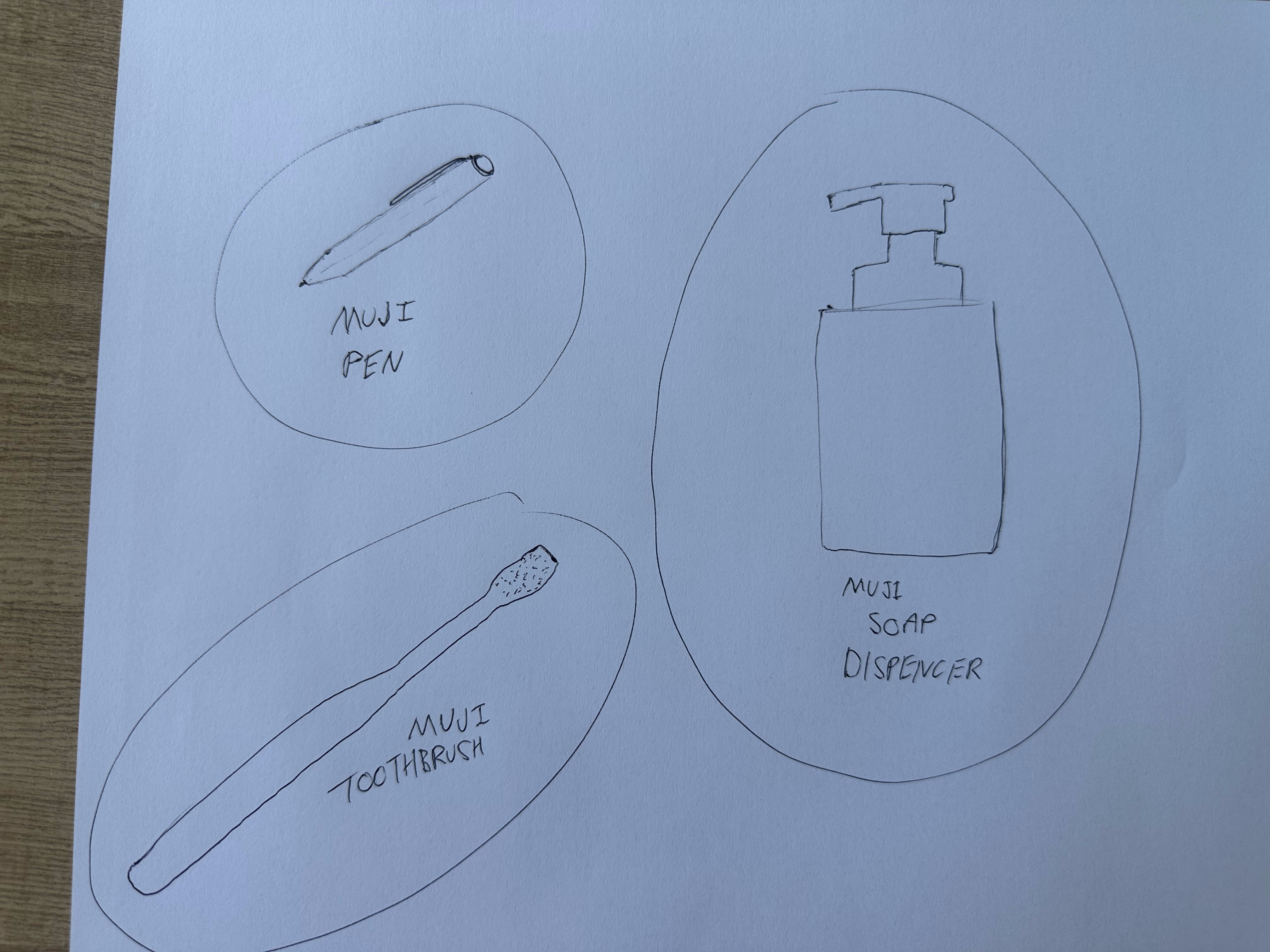
Observation
When you deconstruct and squint your eyes looking at these products, you can clearly see that Muji literally takes the original and most common visual approach to their design. A toothbrush is so simple, it's a line with bristles at the top. The pen is just as simple, no texture, just a button on the end and a clip. These products represent that if you were to ask someone to draw a product based only on what they think it looks like, that's what Muji is.
Muji-Style Torch Concepts
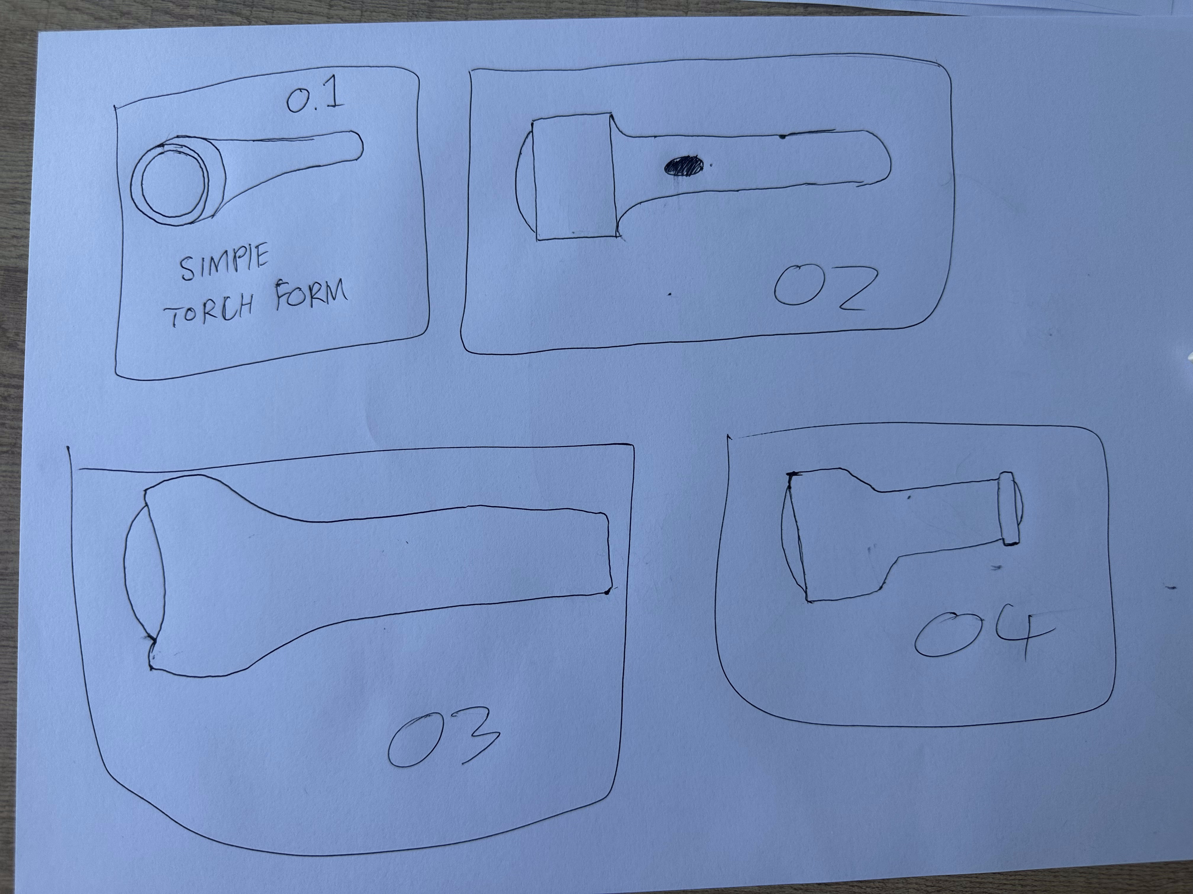
Concepts
01. A simple torch based on the iconic form.
02. A bit more "flashlighty," with a button on the form and concave fillets on the transition from handle to head.
03. More bubbly, exposing the lens more, still very simple as one large moulded form.
04. A basic-style torch with an angular form but softened vertices and a prominent button on the back end.
Reflection
I found Muji to be a brand that is literal in its design, taking a silhouette and transforming it directly into the object. I found this very different to my own design style, as I steer away from basic and traditional forms. Although my principles are guided heavily towards simplicity, which I do see greatly in Muji, overall I don't see my designs comparing with this brand. I did appreciate the simplicity in terms of it being for all consumers, that's what allows for cheap products that are still quality, because the design isn't over the top and can appeal to a large demographic.
End of Week Reflection
Sketching
Which sketch communicates the strongest meaning? Why?
Honestly, I found the most impactful sketches are the silhouette sketches, like Muji. The silhouette is the main part of a form and is the best way to not only indicate strong form and aesthetic, but to be quick in the ideation process.
How did modifying curves/angles change the emotion of the torch?
It definitely allowed me to see a different feeling for the object. Like when I took the idea of a sculpture and only changed the size, or the angles, or made one bubbly, it changes so much about how you look at the product. It triggers the brain to think differently, which I've been finding out about through this whole development. Emotion is so important, and emotion can be conveyed through visuals even though it comes from inside.
Which ideation category came most naturally to you?
Definitely wearables or nature. I love producing fun, innovative ideas based on things around me, so with wearables I just thought of things I wear and turned them into a torch. With nature, I love having these funky, non-angular forms like nature has. This stems back to how I found that nature isn't linear in its design, it's very organic, and I found a new passion for going down this thought and design style.
What are two aesthetic directions you want to explore further?
Definitely sculptural, as seen in my concepts. I'd also like to look at how materials change the look of sculptures, like how chrome really defines the curves of light around it, or how different materials look more comfortable to touch, which might be good for developing a torch sculpture out of.
Week 6 Ergonomics, User Interaction & User Satisfaction
Ergonomics, User Interaction & User Satisfaction
Anthropometry vs Ergonomics
Following this video, I was introduced to some concepts of ergonomics that I hadn't fully realised prior to watching it. Mainly the psychological and physical ergonomics. I often thought that good ergonomics is built to feel good on the body, like a nice comfortable grip on a hammer, or nice padding on your hand for a mouse, or even great curvature for your back on a chair. However, before watching this video I was using a hand drill, and now linking my new knowledge with that event, I realise the psychological ergonomics. The way that your hand is guided directly into the handle, so your hand rests just under the lip of the motor, that psychological factor contributes so much to the smooth motion of actually grabbing and lifting the product. Yet again, the balance and proportions of the drill make it physically ergonomic. If it's too heavily weighted to one side your physical movements can't be as precise and accurate, as there's an asymmetric force disrupting your physical senses.
Overall this video was insightful, providing me with a new view on not only how products feel, but also how they are used.
Ergonomic Design
Firstly, there was something that stood out to me at the 1:28 mark, the narrator of the video says "there are no straight lines on the body," which made me realise so many new perspectives. The fact that within design we often use lines, edges and simple primitive shapes, this isn't how nature built humans. So then I thought, why do we use so many straight lines? Although they do work in the simplicity and the visual appeal of design, if we're here to design things for humans, let's calibrate the design to the way humans were made. Overall I feel like I'm going to take this realisation into my future designs, especially for those that are very connected to the human body like hand products, clothing, or human interactive furniture like seating and beds.
The second key takeaway from this video, which expands on the previous one, is that ergonomics isn't just feel, it goes further into all sensory experiences, sound, smell, haptics and also emotion. When I tried coming up with an example I thought of the exhaust noise of a car, and how that satisfies people, however I don't believe that's as much of an ergonomic factor and maybe more something else. However what I did come up with was the small vibration on your phone. Some digital apps and software features on Apple phones (like touching the keys on your screen) give a haptic vibration to help trigger not only the visual on screen pop up but also your sensory feels to give you that ergonomic persuasion that you're actually clicking a physical button.
OXO Peeler Reflection
How would you describe the OXO peeler?
I would describe it as prioritising the user over the looks. The way the company and designer found a problem and helped create a comfortable and usable grip for just his wife turned the whole industry around. One simple problem changed a product entirely for an entire demographic. It's a really strong representation of organic ergonomics on the touch.
Who was it designed for?
Originally it was designed for one person, to help with arthritis, but now it's designed for everyone and anyone who finds a comfortable, gentle, and easy to hold grip useful on their peelers.
Who designed it?
Sam Farber designed it to help solve an ergonomics problem for his wife.
What insights remained with you about designing for inclusion?
The most impactful thing I learnt was how generally a product might not be poorly ergonomically designed until someone who struggles realises this. Hence a stronger solution is made, and this then changes a whole demographic's perspective after they compare the old poor design with the new one. So overall, design can always improve, and it's not till one person points out a simple issue that the design changes for the best.
Ergonomic Analysis
Breaking down how hands grip and interact with everyday tools, to understand what ergonomic cues communicate strength, comfort or control, and how those cues can carry across into the torch.
Part 1 / Hand Sketching
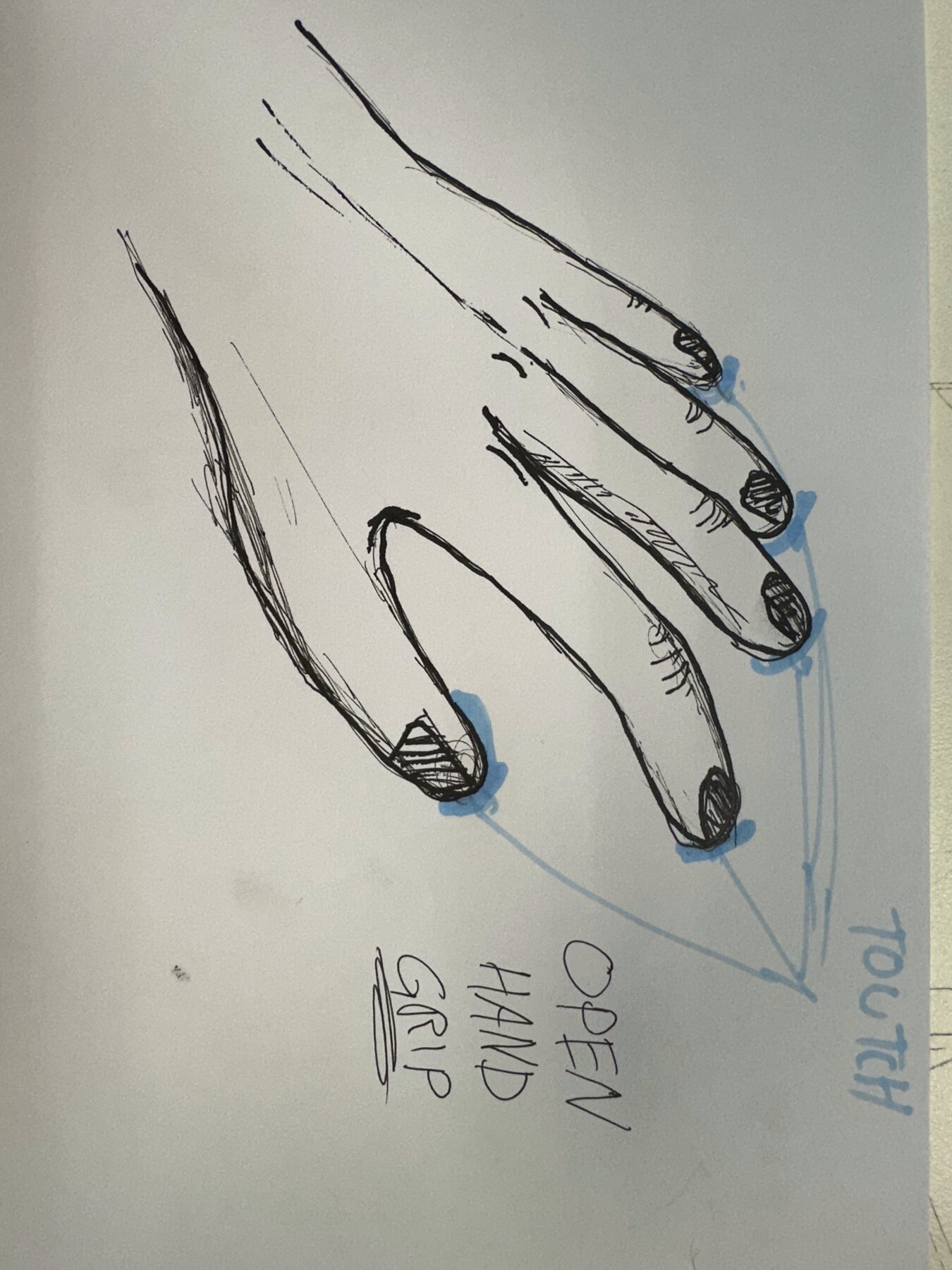
Relaxed
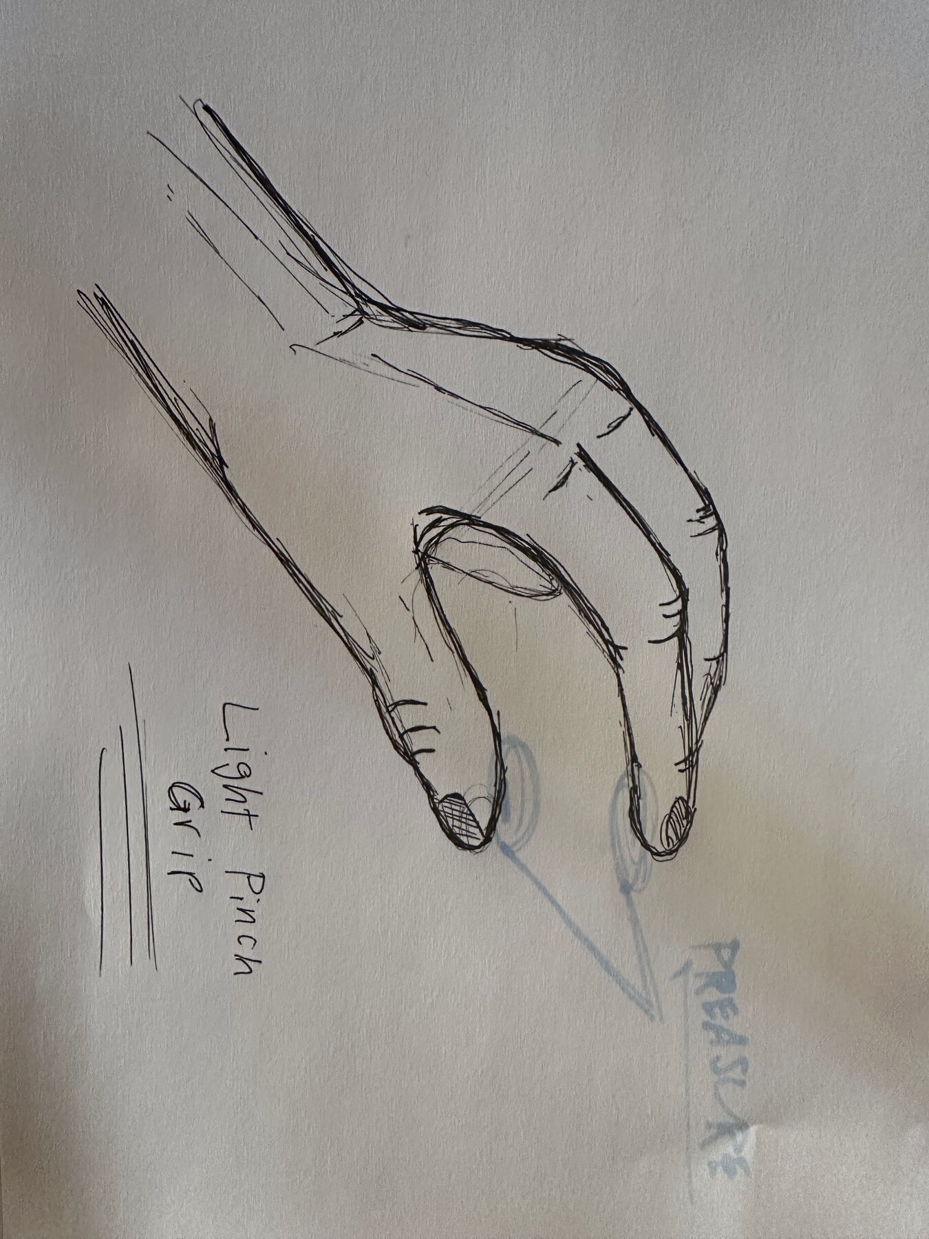
Light Grip
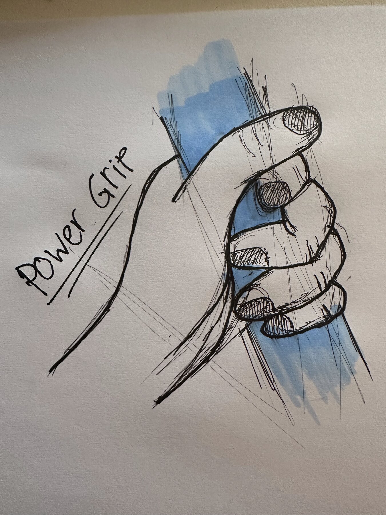
Closed
Part 2 / Tool Grip Analysis
Torch
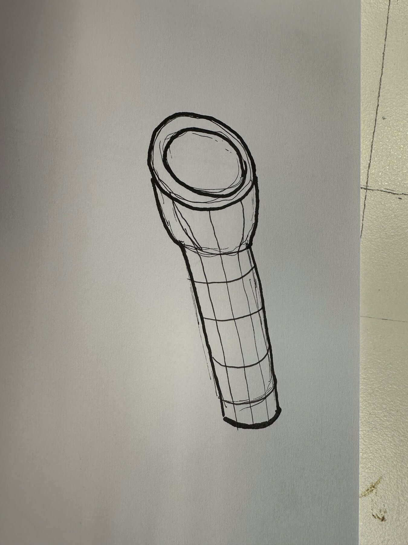
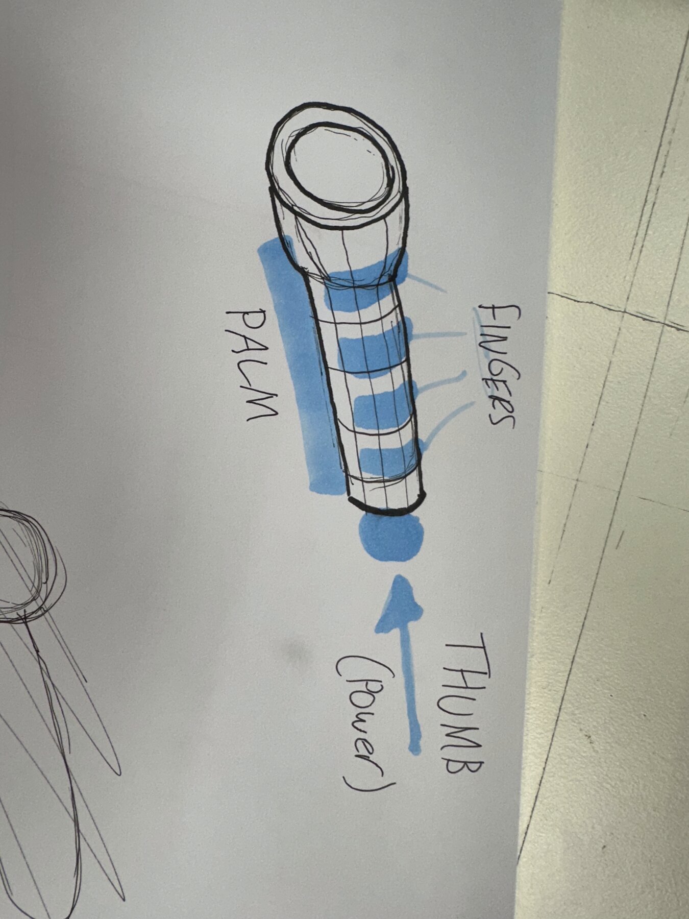
The 4 fingers wrap the underside while the thumb holds power at the top.
Fiskars Precision Knife
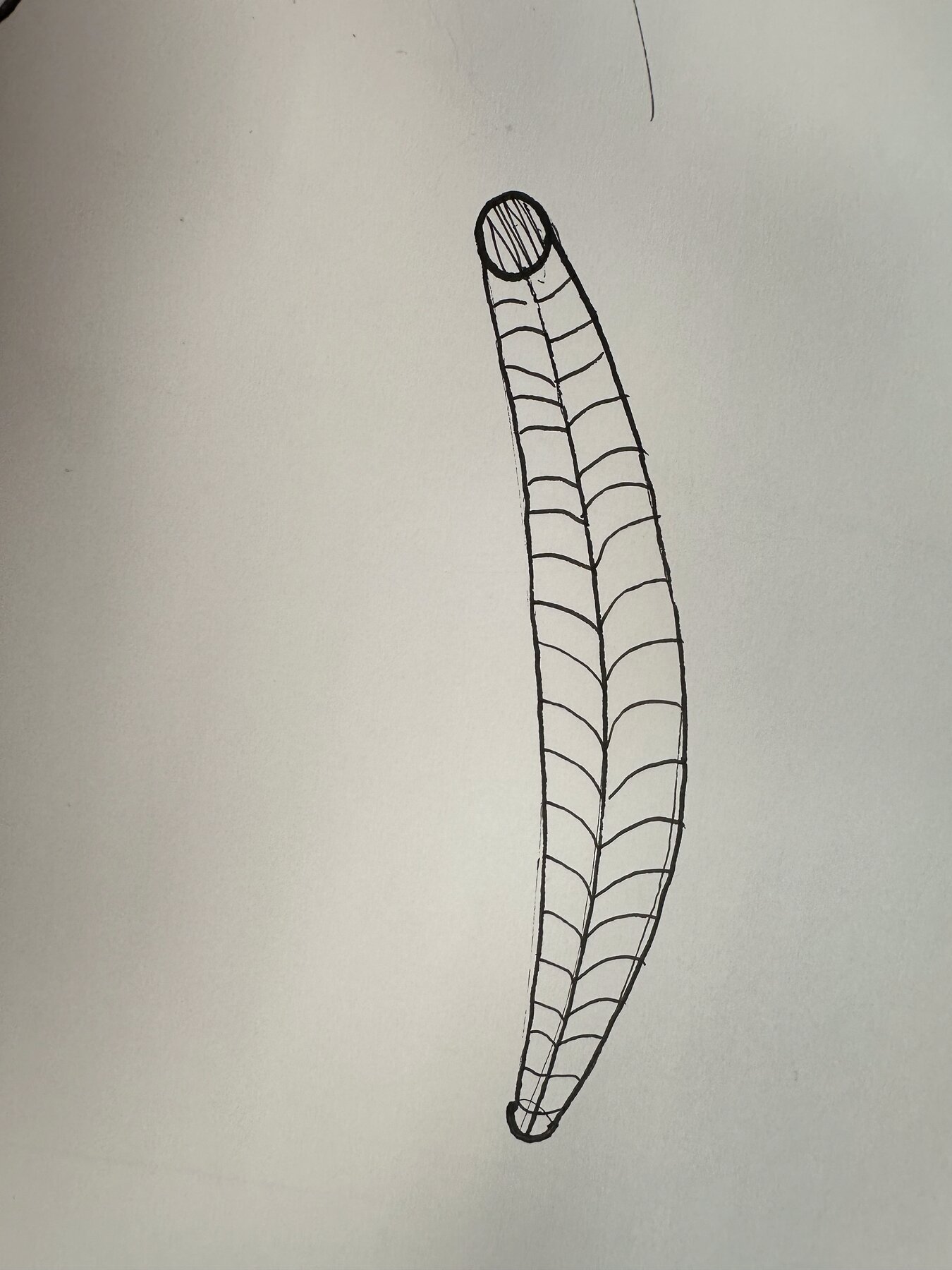
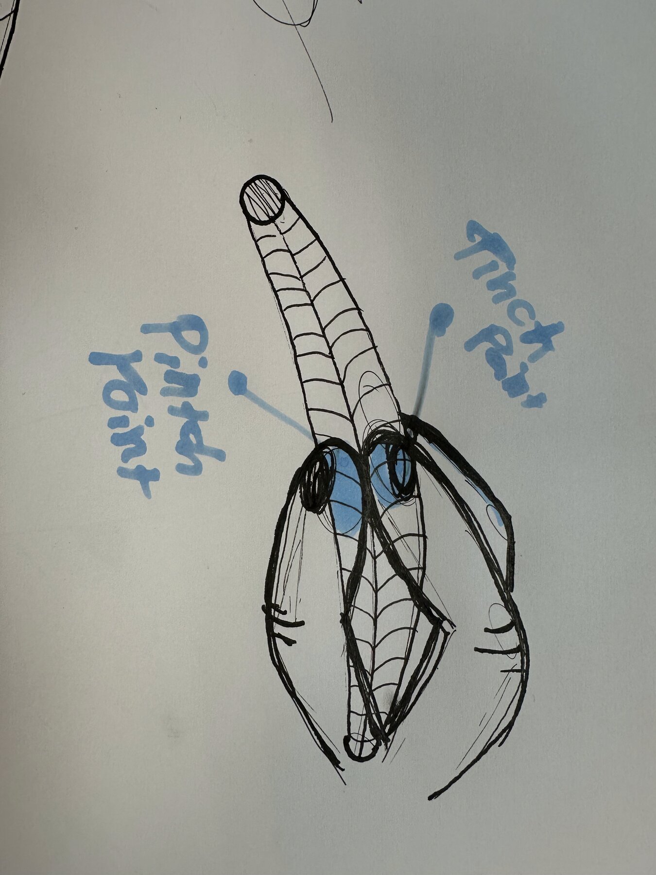
It's a pinch grip with 3 fingers symmetrically placed on all sides for even force.
Screwdriver
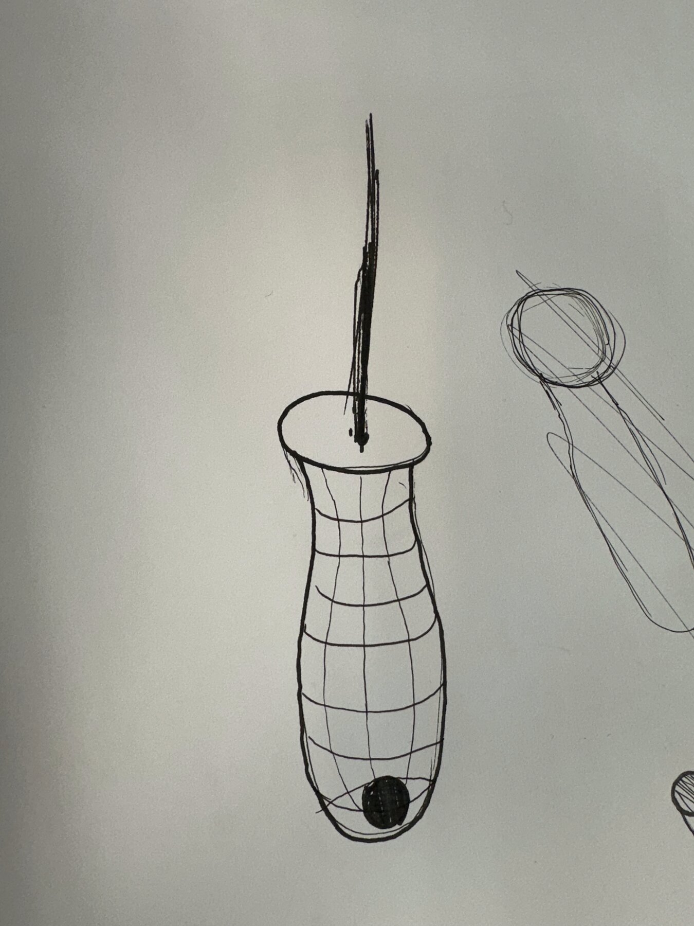
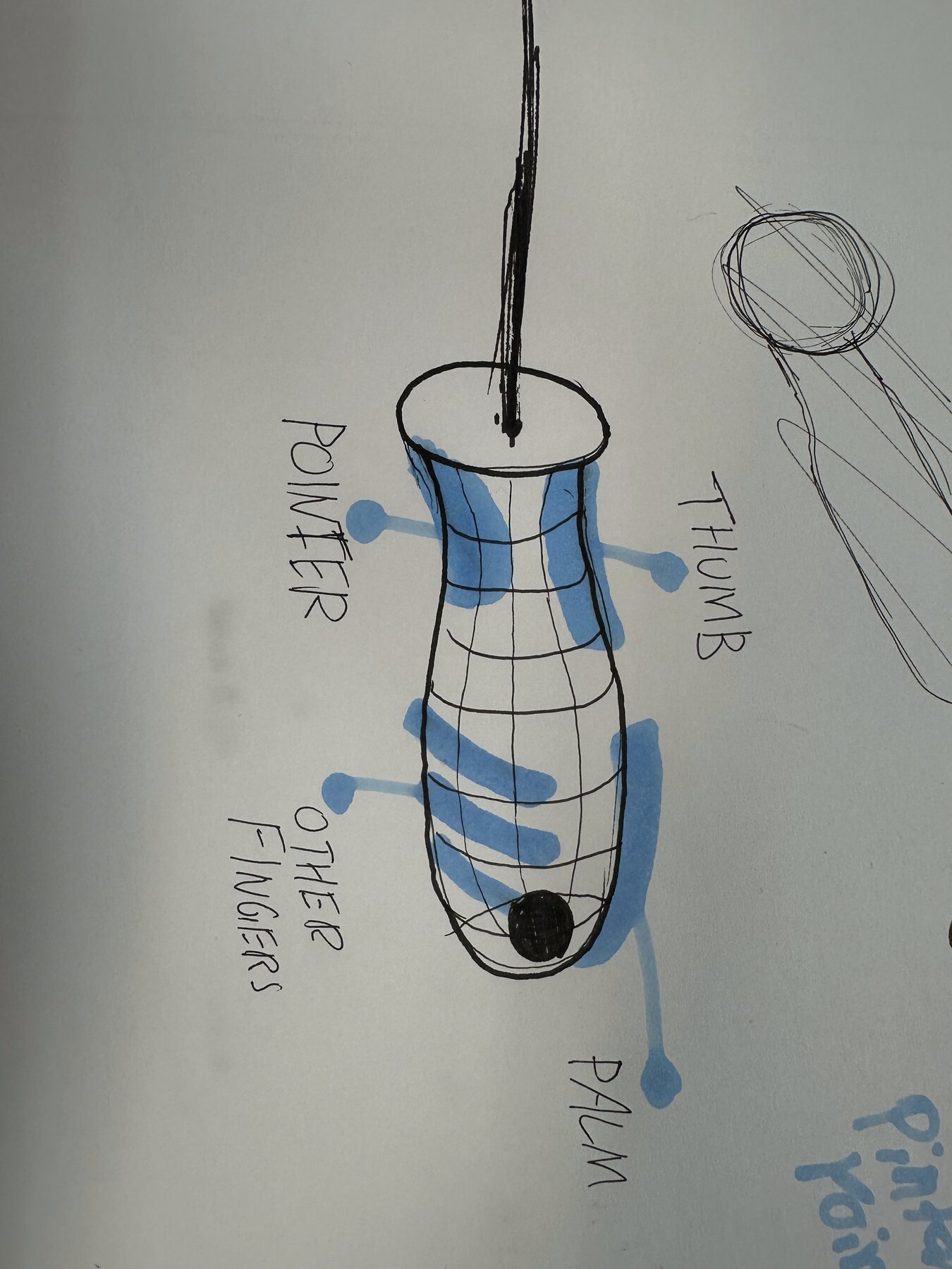
There's lots of pressure on the thumb, while the other fingers wrap the underside to help hold the product tightly in the ball of the palm.
Part 3 / Aesthetic Message
Torch
"The simple cylindrical form of the torch indicates a universal grip point, like a bar."
Fiskars Precision Knife
"The waviness and concave curvature nest the fingers and give meaning of a soft, simple, guided grip."
Screwdriver
"The concavity of the screwdriver suggests strength in the ergonomics and allows you to feel the force pushed into the tool."
Handle Replicas
Remaking an existing handle form by hand in clay, to observe how the shape is actually constructed and to feel the ergonomics first-hand rather than just looking at it.
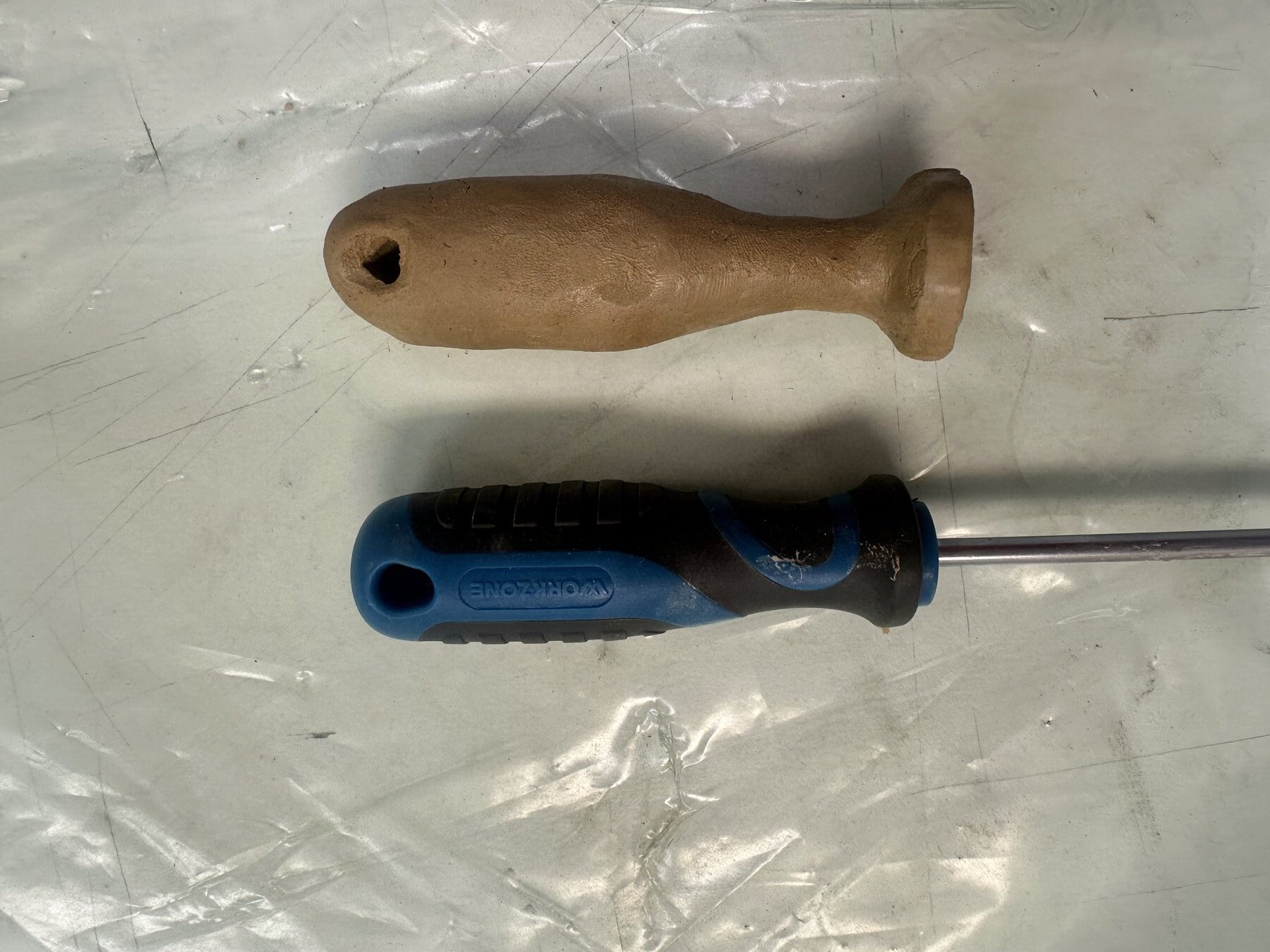
Working in clay was a good way to actually feel how the form gets made, rather than just looking at the handle and guessing at its shape. Pressing the real screwdriver into the clay and pulling it back out showed me the negative space directly, the exact hollow that moulds around your fingers to create grip. It made the ergonomics tangible in a way sketching alone doesn't, you can feel where the material swells to fill the palm and where it tapers off to let the fingers wrap around, and that hands-on process taught me more about why the form sits comfortably in the hand than analysing it from the outside ever could.
Maglite Case Study
Breaking down the Maglite's form, grip and texture to understand how its design guides the hand into holding and using it.
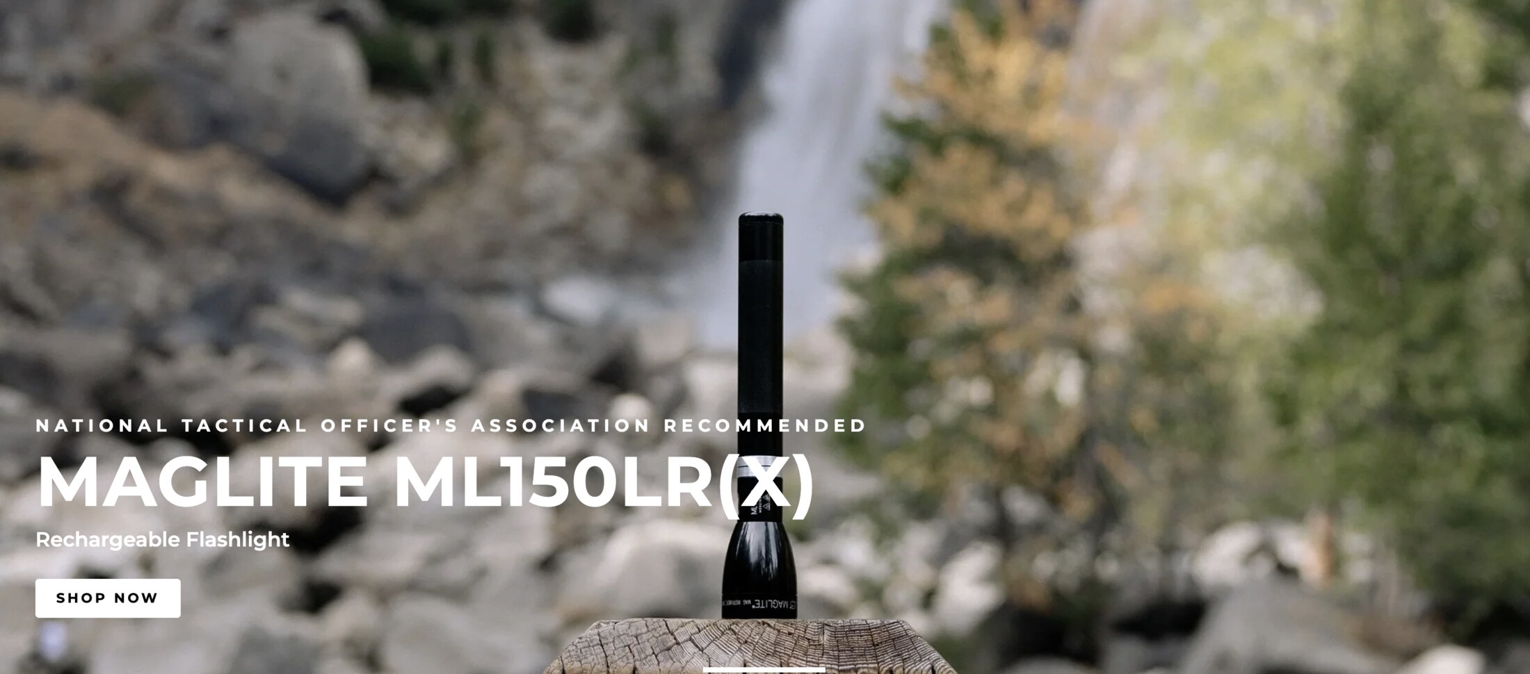
Form & Grip Questions
What does the form suggest about how to hold it?
Upon instantly opening their website, this question became clear. The image they used on the home page showed the torch, lens down, with the extremely long handle pointing upwards. This exact position of the form showed me that it's like the handle of a sword stuck in stone, there's an obvious grip and pull motion on the long handle of the torch.
Where does your thumb naturally rest?
I think this depends on how you hold it. If you have it in a full power grip, your thumb is tucked under and back around to your other four fingers. But if you use the less strong power grip, where the thumb is pointed up the handle, it rests right where the power button is. This suggests meaning in the placement of the button, matching how humans naturally hold items.
How does the texture guide grip?
The texture is only on one part of the whole cylindrical handle, so it naturally and unconsciously tells the hand, through feel, where it's meant to be held. They probably placed it higher up the handle, as it adjusts the centre of balance to be more balanced and stable rather than at the back of the handle, hence there's no grip texture back there.
Drawing Analysis
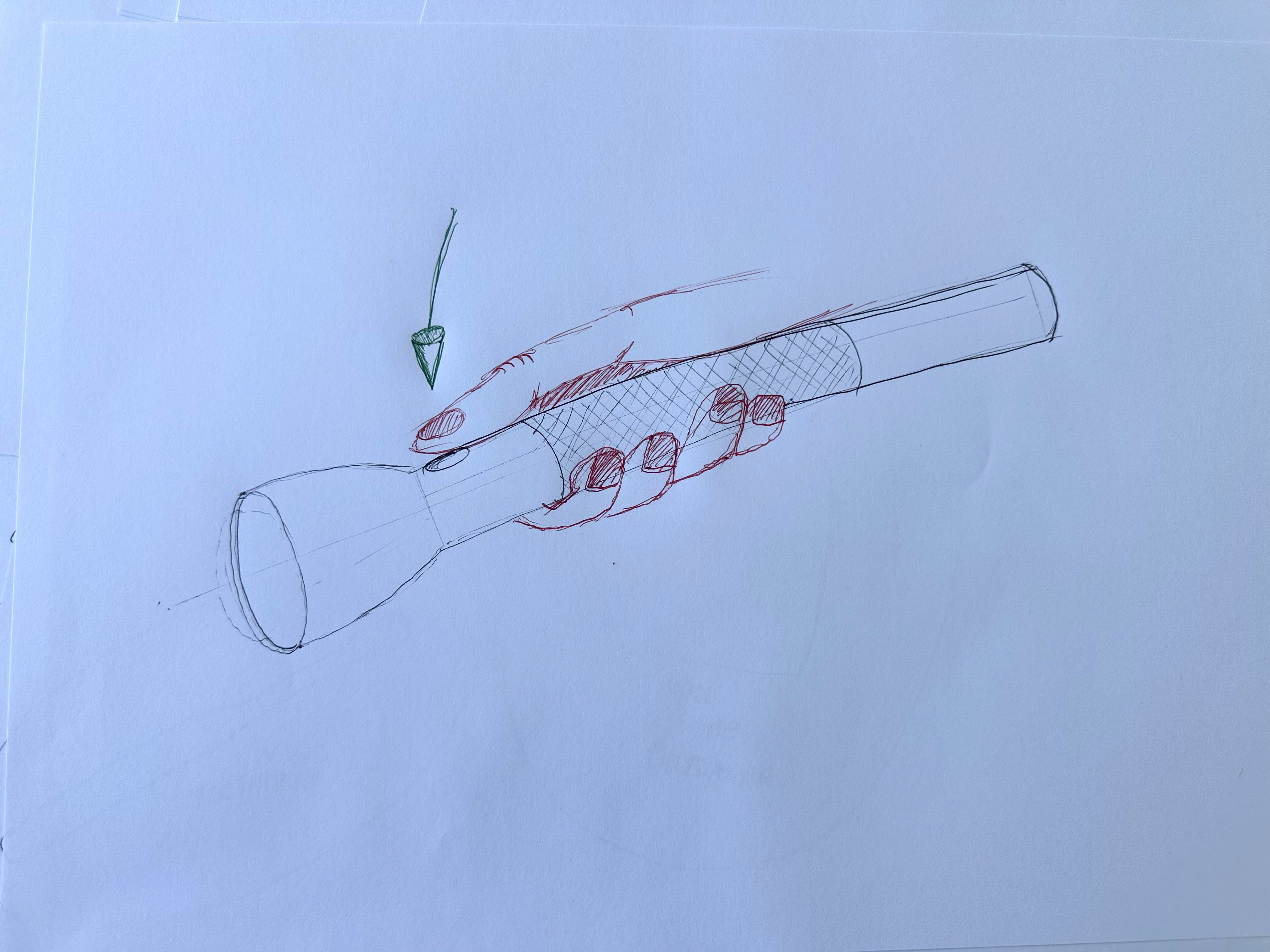
Thinking Timeline
1. Drew the form and added some details like the texture and button. I started to see how the composition and reasoning behind these features were important to how the product works.
2. Started imagining how I'd hold it, referencing a similar torch and other long cylindrical objects. I realised the texture lined up perfectly with the combined width of my four fingers.
3. Once I had that image in my head, I started sketching how it would look held against the torch.
4. Drew the hand exactly how I see it gripping the torch. It's clear the grip and button composition is perfect, it aligns with the ergonomics and anthropometrics of the hand.
5. Anthropometrics was something I kept thinking about once I'd drawn the hand. I used green indicators to show that the pressure the thumb needs to push the button is minimal, it barely needs to move. Rather than placing the button anywhere else, it sits exactly where the body needs the least movement, an ergonomic decision.
Hands & Ergonomics Reflection
What did you learn about hands that will influence your torch design?
I found it interesting about the touch points with a hand to an object, having an object curved in a certain way helps supply more touch points to the hand, however if it's a flat object, due to the hand's waviness, there is less touch point and therefore less grip.
Which tool had the most successful ergonomic features and why?
A lot of products succeed in different areas, however the one I remember is this screwdriver I had. It perfectly moulded around my hand and guided my thumb perfectly into a crevice for strength, and gave lots of surface area touch point to my palm so I could really get a feel of the object and apply force.
How can ergonomics contribute to meaning in your torch (e.g. comfort, confidence, safety)?
Well, depending on a product's usage, that determines the meaning. If it's an object like an axe, you want a lot of grip because you will be swinging it and it needs an abundance of force transfer from your body to the strike point, therefore the handle needs lots of comfortable grip and also surface area for maximum connection to your hand. If it only had connection to your fingers, that's more force into your fingers and more likely to produce an aching feeling and not be an ergonomic solution. Therefore the ergonomics of the grip of an object needs to coincide with the meaning of the product and its function.
How did sketching tools and hands change your design thinking?
Well, it made me actually realise how it looks rather than feels. Understanding the natural design of hands can help influence the design of my tools to ensure I'm designing for a human and not for my aesthetics.
What ergonomic decision will you carry into your next design iteration?
Looking at nature and how it's made, rather than typical straight lines. The human body isn't straight, it's made of so many curves and organic shapes, therefore a suitable design would also be built around that idea.
Week 7 Sustainable & Ethical Design Considerations
Sustainable & Ethical Design Considerations
I found it fascinating about the word sustainability. Typically sustainability has always been linked in my head to environmental safety, however connecting sustainability to product design a whole different meaning was discovered. Firstly, sustainability is built up of 3 key factors, Environment (most common), Economy, and Society. The main thing I realised was that if I was going to build a product sustainably, yes I've got to think of environmental waste in the future and how long this product will last, but also think of how society will take on this product for its uses, and if it's going to be a successful product. Additionally the economy also has its factor, as cheaper products tend to not last as long, where more expensive and higher quality products last longer, and then impact on the success of environmental sustainability.
Sustainable + Ethical Design
How does Don Norman's idea that "design should make life better for people" connect to sustainable and ethical design principles, especially when considering the long-term social and environmental impact of a product?
Initially you think environmental sustainability for design is where a product isn't cheaply made and has a low life so that it doesn't get put into landfill so quickly. I guess reflecting on this and trying to compare it to how design should be better for people, the idea of emotional design is strong in this scenario. For example if a product is made with some intention to capture emotional attachment to the customer, then they are more likely to keep it longer in life, ensuring the life of the product isn't small, and is kept for as long as possible.
In Norman's framework, behavioural happiness arises from how well a product works. How might designing for intuitive use, durability, and repairability support both user satisfaction and sustainable, ethical outcomes?
If a product is well made to the point where the function very strongly completes and satisfies the need, then a consumer will most likely want to use the product forever. Therefore this outcome can be more sustainable, as it lasts longer for its lifetime and doesn't cause as much waste.
Reflective happiness involves meaning, personal values, and long term connection. How can designers create products that encourage users to value and keep them longer, thereby reducing environmental impact and aligning with ethical design goals?
Make a product liked by someone. Therefore make it in different colours to satisfy different people, and make it in different sizes, or let people change sizes, to help people want to use it more.
Patagonia Case Study
Studying Patagonia's sustainability and repair-led design philosophy, then breaking down their visual language and applying it to the torch.
Part 1 / Key Principles
Simplicity & Sustainability
This links directly to me as I've been taught that simplicity is key in design. This is something I truly believe in, and it's reflected in my own design work.
"Buy Less, Use Longer"
Becoming an emerging industrial designer, I realise this philosophy more as the more I appreciate design, the more it sticks with me. Good design needs to be appreciated and looked after, hence held longer in life. Cheap stuff is most likely bad design and shouldn't be accepted.
Repair Over Replace
I love this one as it's something I truly do. When something breaks I analyse it and see how to fix the problem rather than replacing it. This is what builds my interest and understanding for design as I learn more in life.
Part 2 / Visual Analysis
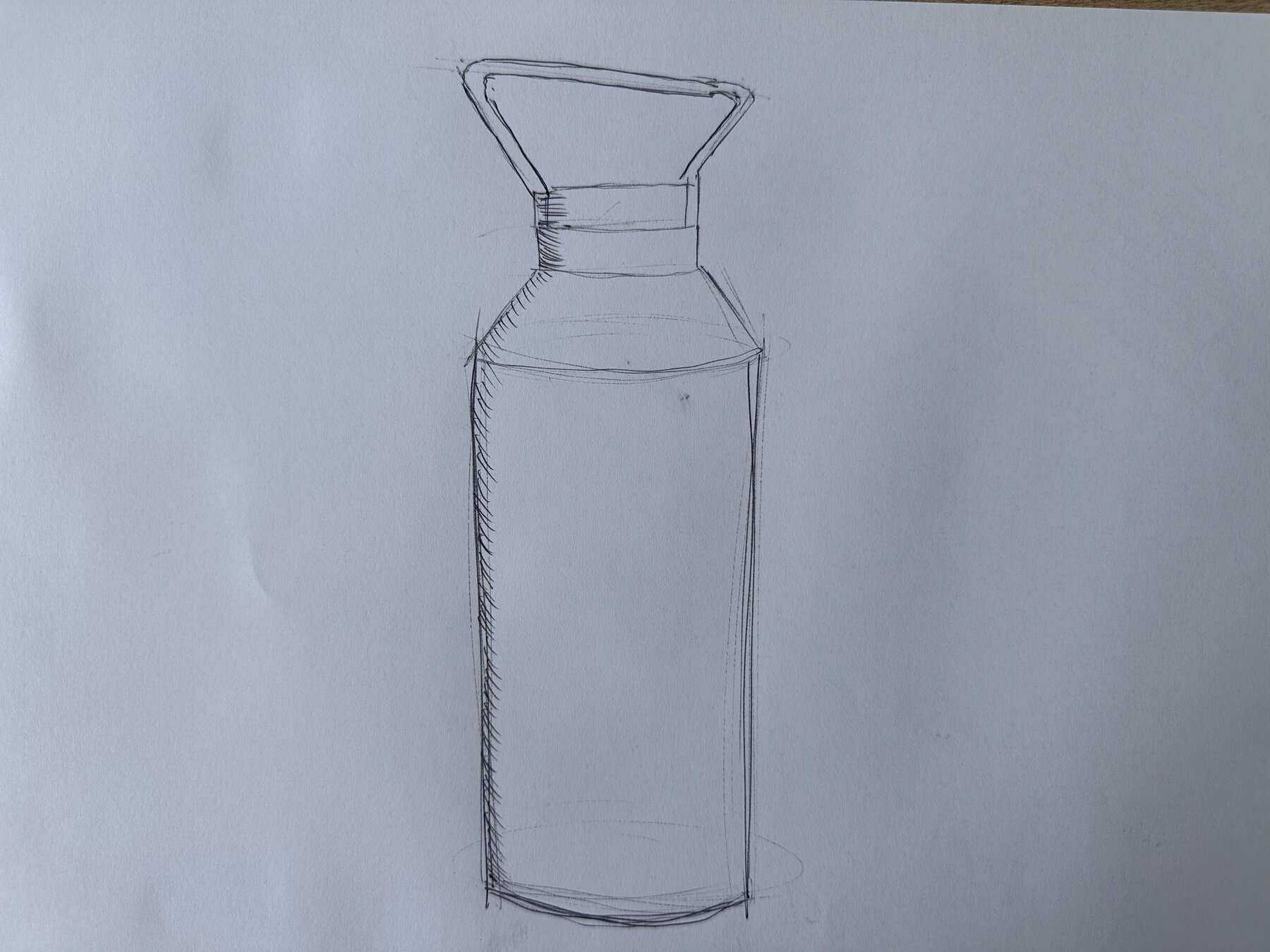
What materials does it suggest?
Strong, durable metal for camping scenarios like common ware. It's coated in some sort of colouring, to give that neutral deep grey colour which looks very natural, like stone. The handle looks like a bit of plastic, for more comfort on your hands but still super durable and a bit malleable, so it won't dent like metal would.
What feelings does the form communicate? (trust, durability, honesty?)
Very strong durability due to its angular form. This also gives it a more aggressive communication which suggests it can be beaten up on camping trips and still survive.
What features indicate long term use?
Probably the metal body. It's going to last long and not get damaged easily, and it's also easy to wash for long term cleanliness.
Part 3 / Apply to Torch
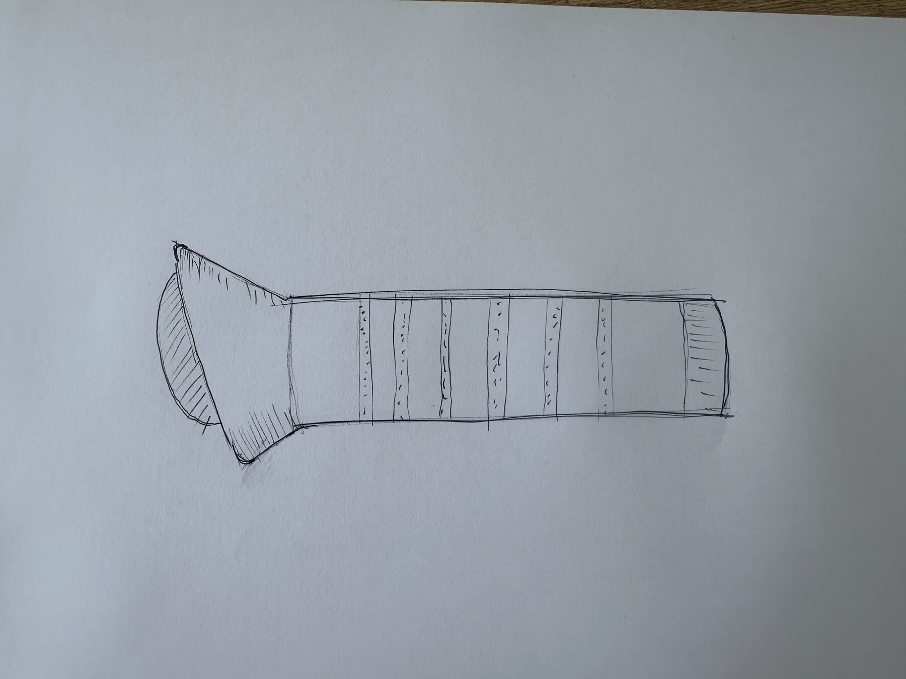
- I used the same form profile on the bottle's lid for the torch head
- I used a lengthy, strong metal handle that was simple but strong, like the bottle
- I added lines of texture to the handle to make it more linear and aggressive, rather than a massive section of texture
Ethics Manifesto
A personal set of design principles, grounded in how I actually work.
“Innovation, created from emotion. Why be the same when you can be different”
— Jackson Arnold
Innovation
I don't want to just copy what's already out there or follow a trend to look advanced. To me, innovation is actually solving the problem in a new way, not just making something look different.
Attention to Detail
This one's wired into me from my grandfather. He taught me that the small things are what separate good work from great work, and that's stuck with me in everything I design and make.
Craftsmanship
I care about the quality of how something is actually made, not just how it looks on paper. The making is just as important to me as the idea behind it.
Emotion
This is something I've only properly understood recently. I always leant towards it without knowing how to explain it, but now I get how important emotion is in design, and I've started expressing it more in my own work.
Eyecatching
I build things with respect, and I want that to show. If my work doesn't stand out in a room or start a conversation, I haven't done my job. I want people to look at what I've made and actually want to own it, and be proud to have it.
Longevity
Good design should last. I'd rather build something that gets looked after and repaired than something that gets replaced the moment it breaks. Cheap, disposable stuff is usually just bad design, and that's not what I want to make.
Concept Concept & Realisation
Concept & Realisation
After everything I'd learned across the research and design phases, this is the thinking that got me to the final torch concept.
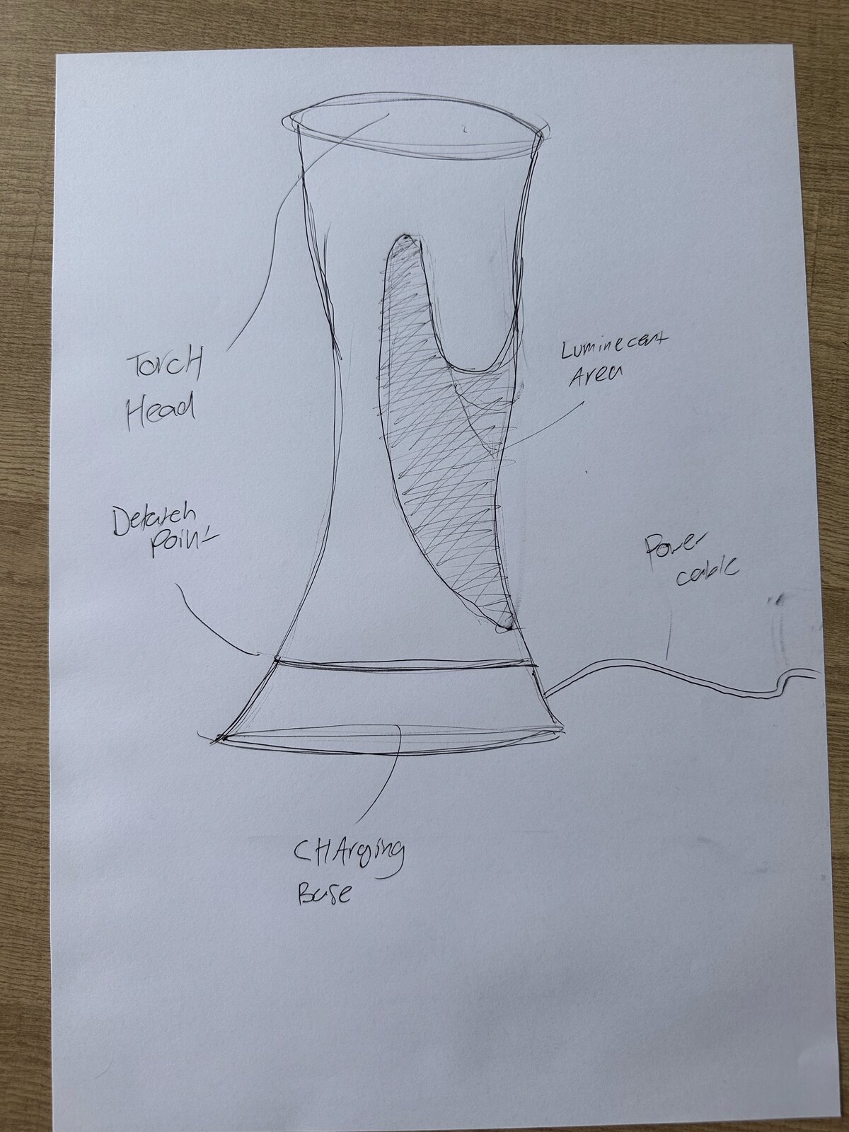
Thinking Timeline
1. My demographic research showed me the problem was never the torch itself, it was the when. When people needed it, it was never ready, or it let them down right when they needed it most. My torch had to always be ready and never let someone down in an emergency.
2. I knew I didn't want to just tick boxes like brighter, smaller, or longer battery life, that already exists. I wanted a sculptural piece that sits on a shelf or side table, where the form itself carries the meaning and emotion, and the negative space tells you where to grab and hold it, without it looking like a torch just sitting there.
3. Once I had that, I got stuck. A nicely sculpted form that fits the hand well is still just a generic ergonomic torch painted a nice colour and put on a shelf. Every piece I design has the one thing that sets it off, the gold wheels on my car, the floating tensegrity table, the two tone timber on my Japanese toolbox, and this design didn't have that yet.
4. I went back to point one of my manifesto, Innovation, and kept writing until I landed on the question that unlocked it: what if the defining feature is that the torch changes the way the sculpture is perceived when the light turns on?
5. That's the missing piece. The carved negative space in the form is replaced with a translucent material that the torch's light shines through. So it's not just a sculpture with a torch head on it, it's a sculpture that uses its own light to create a sense of trust and guide the hand to where to grab it, contrasted against the solid, non-translucent material around it. That's what bridges the sculpture and the torch into one product.
“What if the defining feature is that the torch changes the way the sculpture is perceived when the light turns on?”
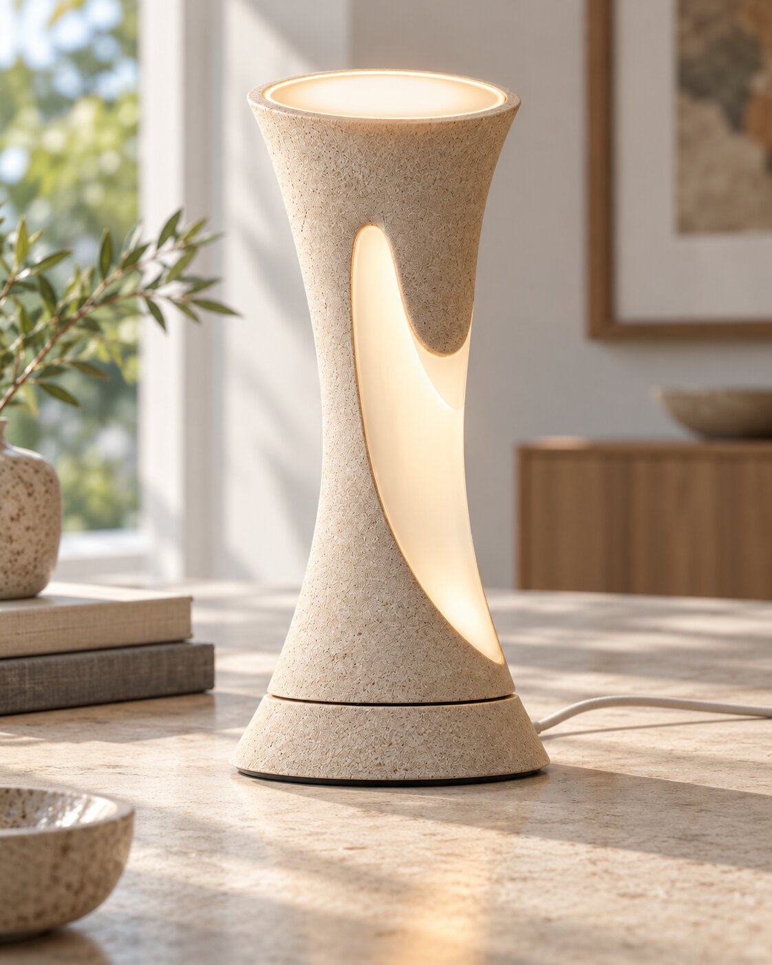
Material Development
Once I had the form and the meaning behind it locked in, it was time to think about the details. For the material I knew I needed two tones, a translucent (not transparent) material for the actual grip, the part the light shines through. For the external form, the part you're not meant to hold, I wanted a highly contrasting material, something you wouldn't instinctively want to hold, but that's still great to look at, since this is also the more prominent material overall. Texture felt like the best way to achieve that, a coarse, sandy render, simple but with enough detail to add that contrast and subtly tell you not to hold it there. For the illuminating part, I wanted a frosted material that lets out a muted, frosted aesthetic light rather than a fully functional light, so it gives off a nice glow without outshining the actual torch head itself. A frosted translucent white achieves that. I still hadn't settled on the colour of the main body though, since that's the most evident choice on the form, but I knew it couldn't be white, because it needs to contrast against the negative space.
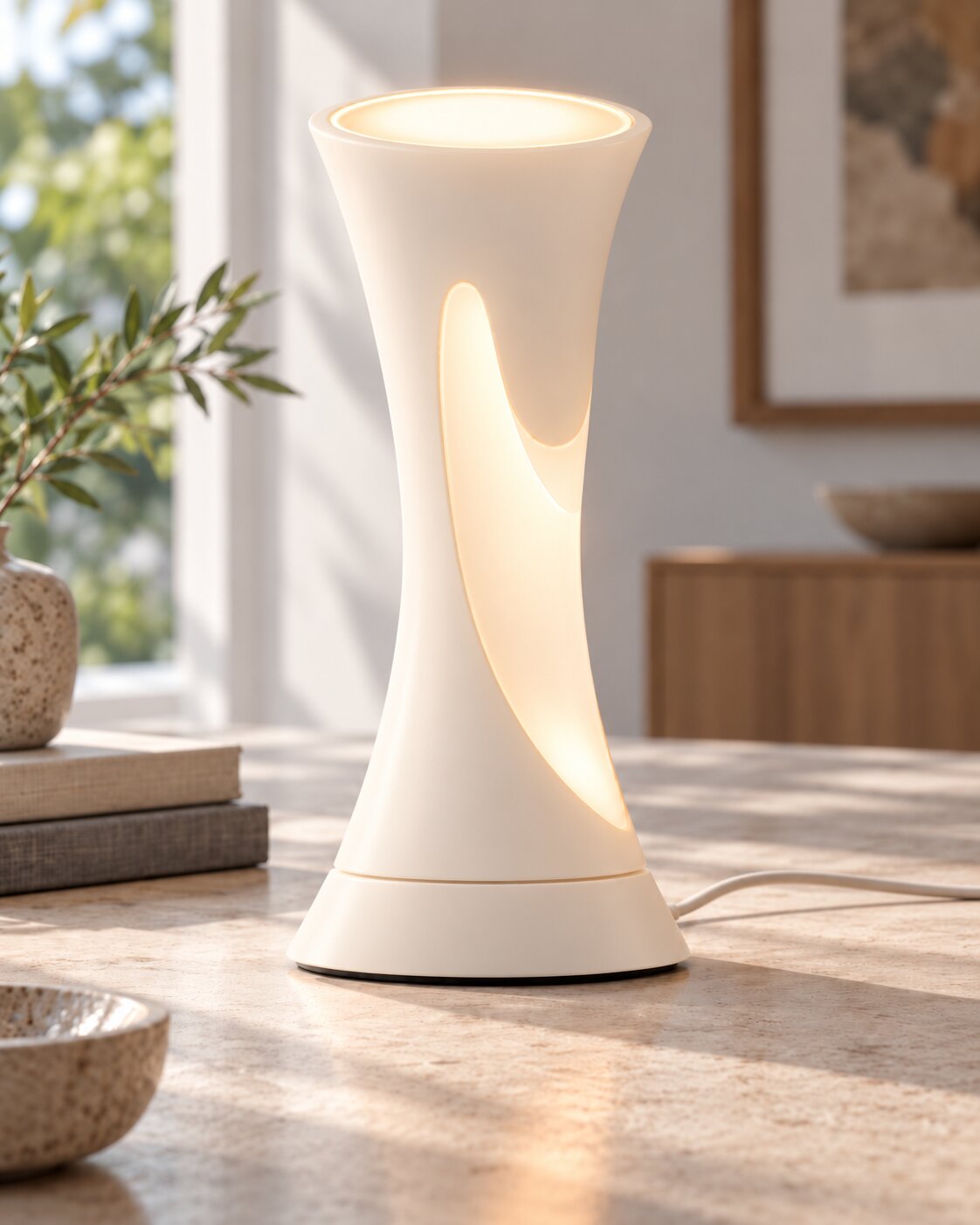
Refining the Material Logic
From here I thought about scrapping the idea of a contrasting material altogether. At the end of the day it's the light and the negative space that indicate the grip, not the material itself. So what if the whole torch was one seamless, moulded, single material all over, and the light became the only thing generating that contrast. This way the light carries more meaning for being there, it's not sharing the job with a second material, it's the sole reason the form makes sense.
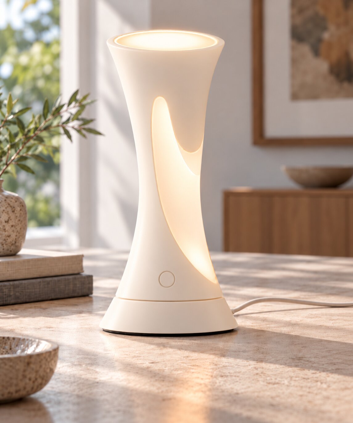
Details: Meaning and Function
The meaning behind this sculpture is that the light guides you to where to grab the product. There's a symbolism in that, reaching for the light in the darkness, a metaphor for when the power goes out or in a dark emergency, the torch is there to guide and save you through its trust.
I added a simple button on the body of the torch, so when it's disconnected from the base you can hold it and turn it on and off like a normal torch. I also linked this back to the meaning, when the base pad detects a disconnection of power, like a blackout, the battery inside the torch automatically kicks in and lights it up in the darkness by itself. So there's some functional reasoning behind the design as well as its aesthetics.