Research.
Research activities exploring design language, visual analysis and product typology as part of the Torch Project brief.
Week 1 Design DNA & Visual Language
Composition, proportion, form + visual balance
Composition
Upon watching videos about composition from Storytelling for Designers, I developed a stronger understanding of this topic. Originally I thought composition was about just arranging things to be practical and aesthetic, however it goes further to teach that elements can be arranged in a way to capture strong stories or guide people's thinking.
Dolphin Torch Research
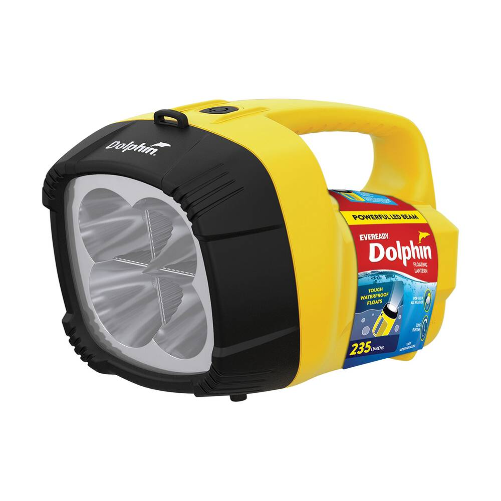
Eveready Dolphin Torch
- Type
- Waterproof floating LED lantern
- Output
- 235 lumen LED beam
- Designer
- Paul Cockburn
- Origin
- Australia (original design USA)
How would you describe the Dolphin torch?
I would describe the Dolphin torch as the everything torch. Whether you need to walk around outside for a big beam of light, or you're in a power outage, the large bulky torch is easy to find and locate in dark scenarios.
Who was it designed for?
I believe it was designed for anyone. I see it as a one-in-a-household product; anyone can use it. It's simple, easy to hold and carry around.
Who designed it?
Designed here in Australia by Paul Cockburn, however the original is from the United States.
What other Australian designs do you remember from the first video?
The one that most fascinated me when I saw it was the pedestrian crossing button. Even though I am building a vision of seeing products and trying to figure out how they were made, some things I still forget that someone actually designed. When I saw the button, there was a sense of 'OMG' inside of me that made me realise someone actually designed that. It's been in front of me my entire life, and it's only now that I've actually realised.
Apple Design DNA
A visual language comparison between an Apple product and a comparable product from another brand, analysed across composition, proportion, form and visual balance.
Key Visual Design Principles
The comparison is analysed across four core visual design principles, each one is defined by my personal discussion below.
The way visual elements are arranged on a product. It's how each element will come together to not only work functionally, but visually, ensuring designers use the design principles like balance, emphasis, contrast, hierarchy, alignment and unity.
This is the way each element compares to another, some might be bigger and some might be larger but that again narrows down to the design principles. You don't want the up volume to be any more emphasised compared to the down volume otherwise there will be confusion on which one is more important and it loses that sense of perfect proportionality considering that both buttons are equal.
One of the most important parts of a design because it tells the story and helps show a point of difference to competition. Sometimes products do near identical things, however it's the form that distinguishes them and that's what makes consumers buy something over the other.
It's a combination of everything, and is built with the design principles. When composition of elements, size of elements and the shape/form of elements aren't visually balanced, a product won't succeed and look like a mess. This may even cause user interface to be harmed as having some buttons not balanced with others just causes irritation to the ergonomics of interference.
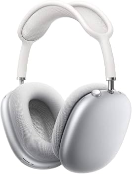
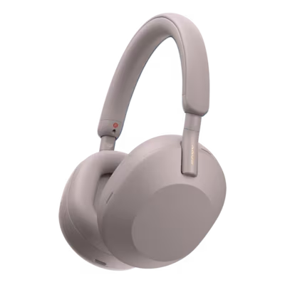
Visual Language Analysis
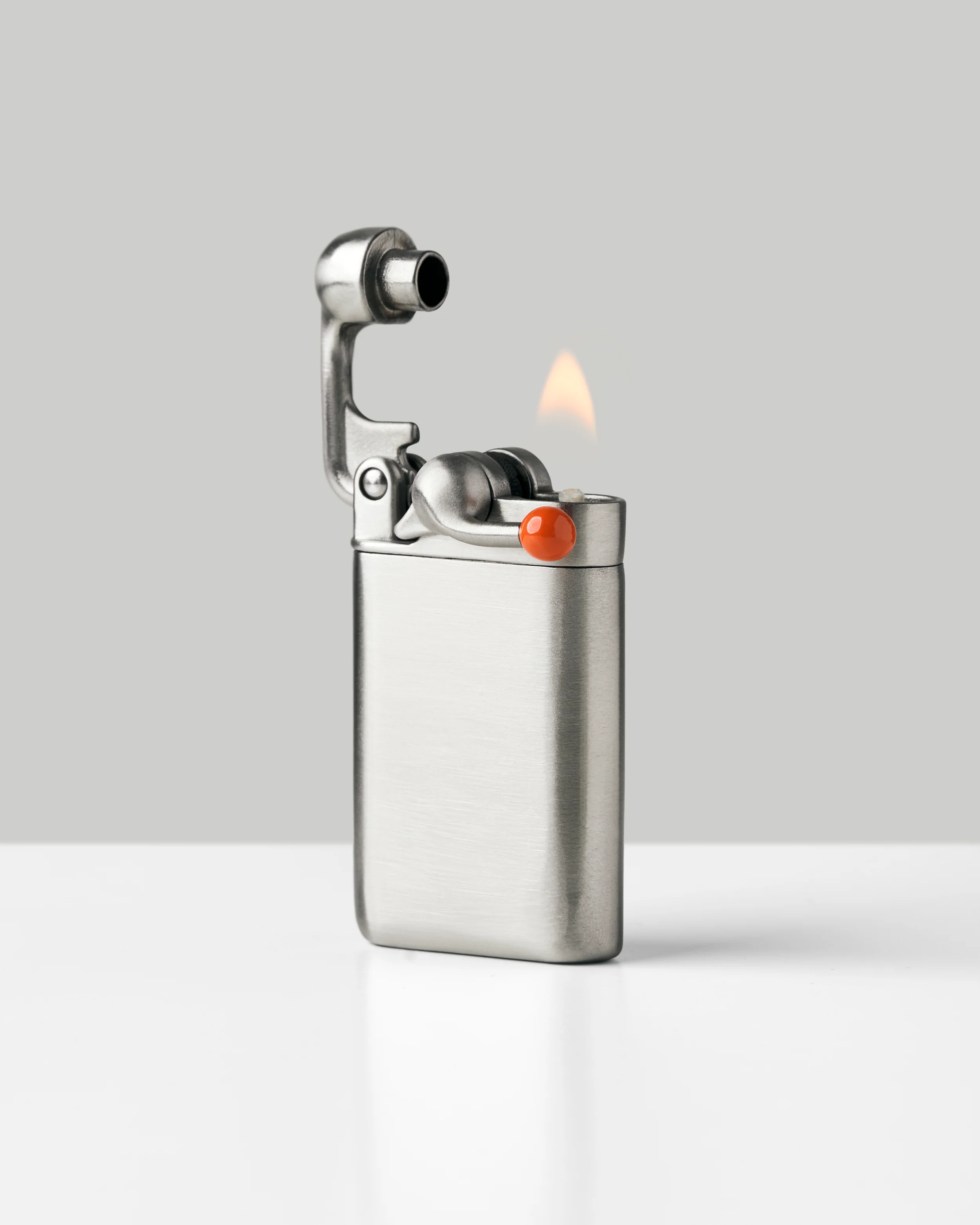
Analyse and compare the aesthetic qualities of six selected hand-held tools, focusing on visual language: composition, proportion, form and visual balance.
Product Analysis
Six hand-held tools analysed individually.
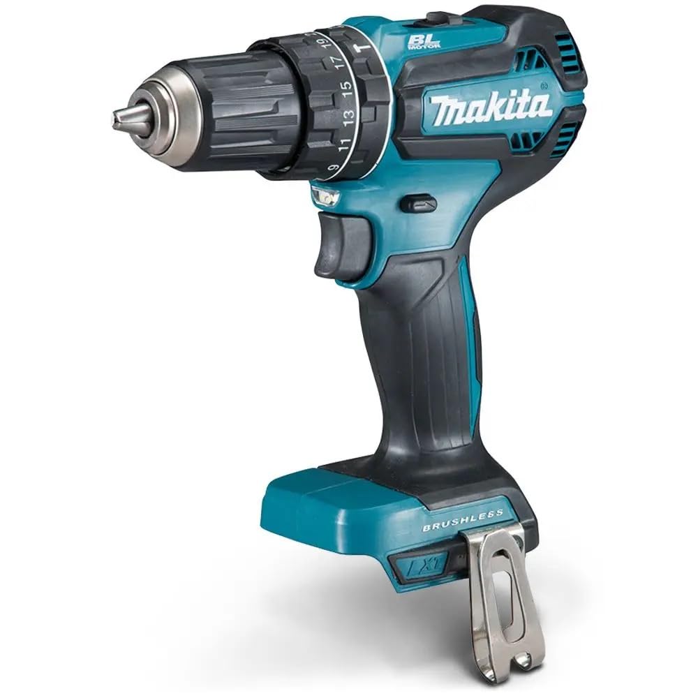
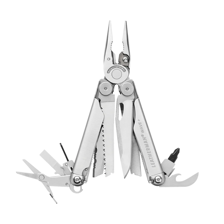
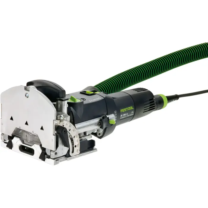
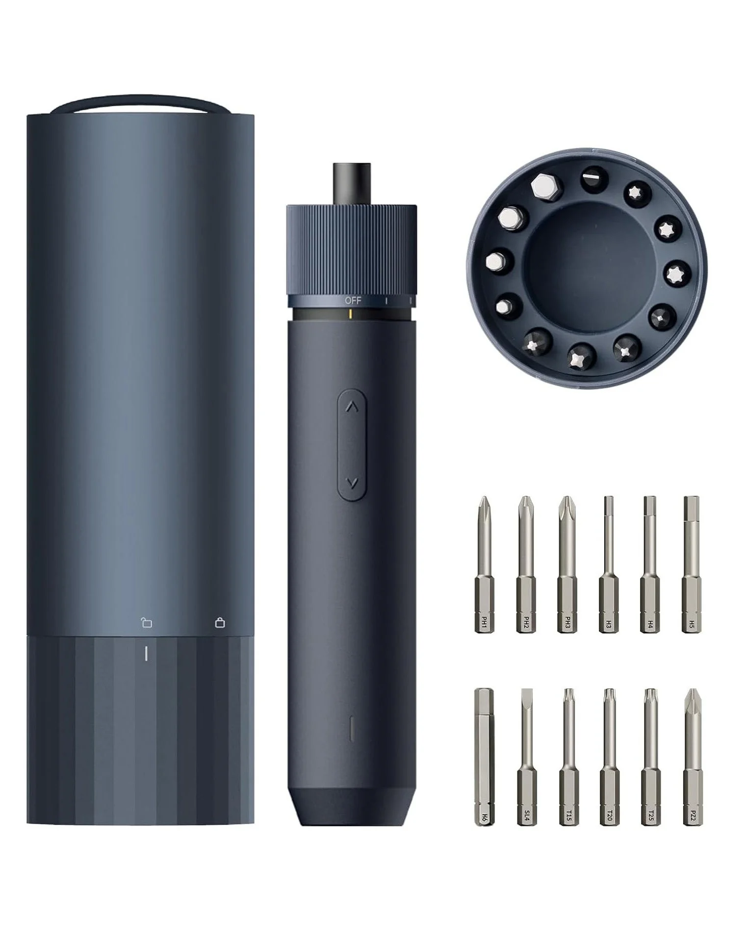
Apple Design Analysis
What are 2 things you have learnt about Apple?
The main thing I have recently learnt about Apple is how important brand identity actually is, and how subconscious it actually is to consumers. When you pick up an Apple iPhone and learn how to use it, then pick up a MacBook, it becomes so subconscious how to use it because it uses the same icons and design interfaces, and things just flow together. Additionally, the visual looks of these two completely different products are so interconnected, with the same material finishes, radii, software and much more, that they feel unified.
Which elements of Apple's 'visual language' interest you and why?
My favourite visual language conveyed in Apple's products is the use of identical radii across all products; the edges of the laptops align perfectly with the edges of the iPhone.
Does form influence perceived usability or quality of handheld tools + torches?
Form definitely influences how you use handheld products. Some items have designated grooves for finger placement, helping indicate how to actually hold and grip the item properly. With objects like Apple iPhones, which are the most common handheld product, they have a very minimalist form but still fit in the hand, which is why every person has a different way of actually using the phone. Some people use two hands, some use one, but this suggests that a minimal form allows for more user expression on how to use the product, rather than a guided form telling you subconsciously how to use it.
Can you think of other products where you have observed cultural or emotional cues in their design?
I still struggle to visualise and realise emotional and cultural views in products. This is because it's not something I've been exposed to look at in my life. I am currently getting a lot better at seeing the importance of design elements in products, but truly, I am still figuring out how to see emotional and cultural elements.
Week 2 Material, Texture & Sensory
Material, texture + sensory experience
Material
The video "How to choose materials in product design?" by Design plus Morna really gave me an insight into materiality in a different way. The most obvious reason for materials that most general people and early learners think of is that it needs to be something suitable, but then suitable can mean many things. The video broke that down, and I found it fascinating that the first thing mentioned was functionality. I would always think of looks or feel as the first thing, but initially constraining your thoughts to what is the most functional and then beautifying it after makes the most sense to help make a product work at its best potential and look its best.
Key concept relations
Then when I link my findings back to the key concept, I realise that once you select the material that is suitable, you then explore the following ways to add textures to help that product become even better when needed. Then, when the material is right and has the right textures embossed, cut or extruded on them, it starts to develop that sensory experience.
Realisation
Now, when I am going to look further at products, I feel like I am going to be able to break down components in a more detailed way. For example, looking at the legs of an office chair directly in front of me while writing this, they are made of metal because there is more weight being put on them, so that is the functional reason. Then the arms, which follow a similar form and colour, are just made of plastic because it does not require as much strength and allows for them to be light and easy to move up and down.
Huskee Cup Research
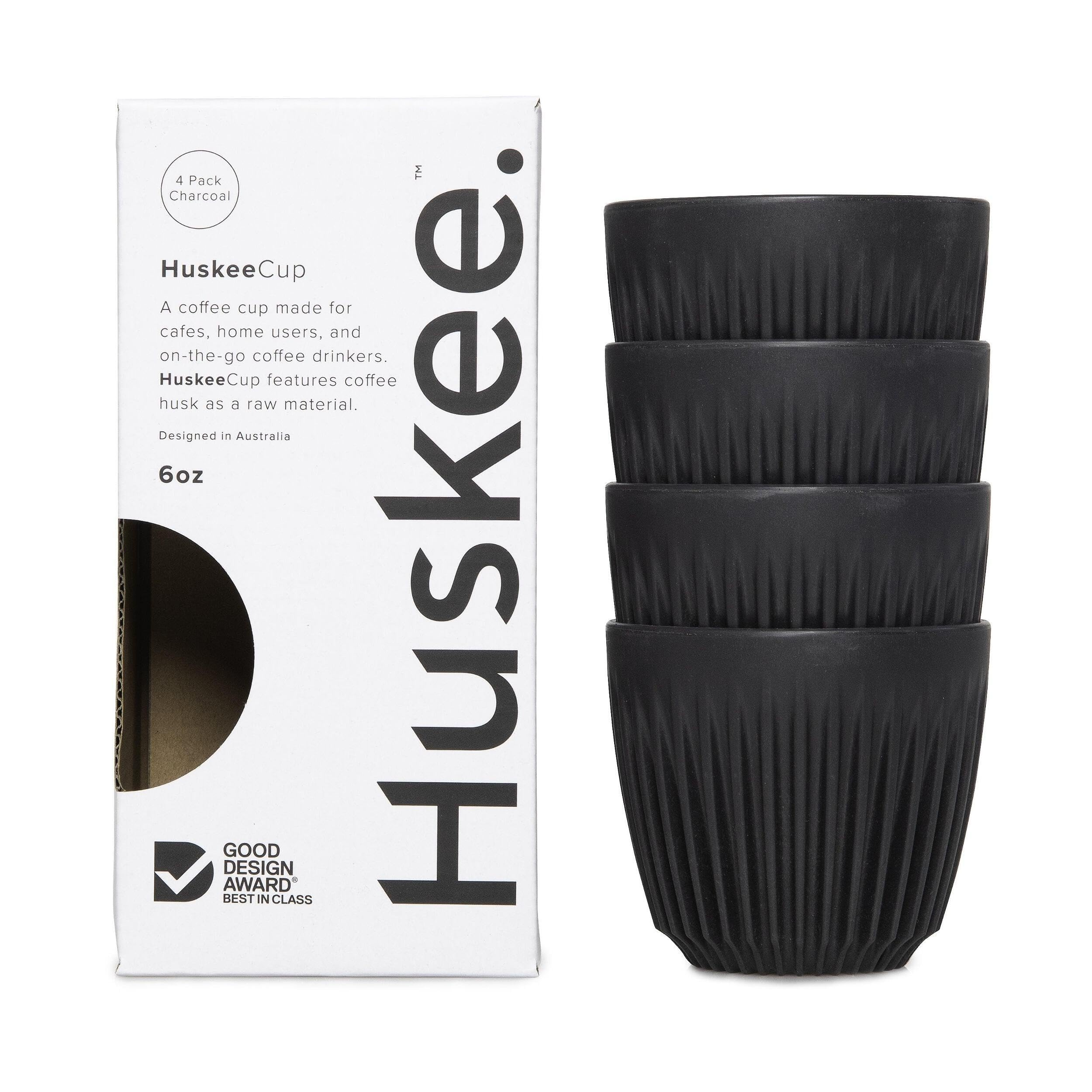
Huskee Cup
- Type
- Reusable coffee cup
- Material
- Coffee husk biopolymer
- Designer
- Vert team
- Maker
- Huskee (Australia)
How would you describe the Huskee Cup?
I would describe this Huskee cup as innovation in the realm of materials, not form. There are many cups out there that don't use handles and have bumps on them, so I don't see that as innovation, but literally using coffee husks to make a coffee cup is very innovative and makes total sense. I would also describe this cup as very cafe friendly, as they mention they have different styles and matching saucers.
Who was it designed for?
I don't see this cup being designed for a specific person, but for anyone who likes this style of cup, and even for cafes this product is suitable. It's designed for someone who has a preference for this style of coffee cup, or for the greenies out there who want to support environmentally friendly design.
Who designed it?
Designed by the Vert team for the Huskee group. (Australian)
What are your thoughts on using waste as materials?
I believe using waste as materials works well in product design if it has a proper connection to the product, which this definitely achieves. Coffee husk for a coffee cup is just perfect. However, I don't believe designers should go out of their way to completely invent a new type of sustainability approach unless it has meaning and doesn't ruin the manufacturing cost, which then affects the price for consumers.
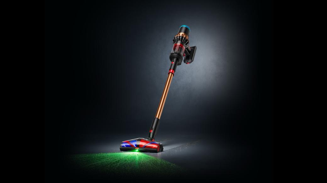
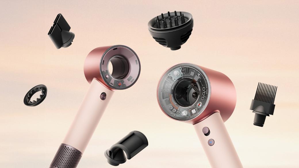
Material, Texture & Sensory Experience: Dyson
A comparative analysis of material choice, texture and sensory experience: how a product feels, sounds and responds in the hand, across two Dyson products.
Material, Texture & Sensory Experience: Tools & Torches
A comparative analysis of material choice, texture and sensory experience between a hand-held tool and a torch.
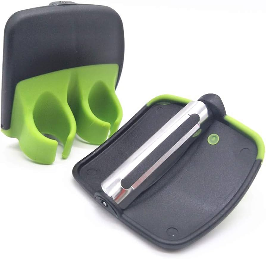
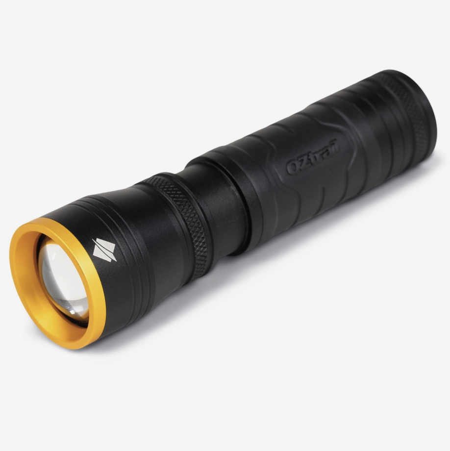
Dyson and Handheld Product Design Analysis
How did the Dyson's materials differ from the generic tools and torches, and what did that say about each product's personality, value or intended user?
I found Dyson to have very smooth metal finishes, with matte and glossy cylindrical surfaces, whereas other products have texture on their metal for more detail and a textile approach. It shows Dyson's simplicity within design, and how they value their complexity on the inside and through the use of colours (heavy with the use of red, blues, gold and silvers all on one product).
Which textures felt most comfortable or intuitive, and how could those qualities inform design choices for your torch's demographic?
Honestly, I find chrome and glossy metals very poor, as they leave hand and finger prints and highlight scratches in the surface, whereas matte finishes like Apple laptops completely eliminate that. When it comes to my design of a torch, I wouldn't use chrome or high gloss parts anywhere a hand regularly touches, only for subtle things like the rim of the torch we saw on the F300 Lumos Battery Operated Flashlight.
How did weight, temperature and tactility affect usability, and how would this change for a child, an elderly person or an outdoor professional?
I found weight to mean two different things: there's physical weight (how heavy it is), and there's weight in design (bold or striking colours or textures). Heavier products do feel more luxurious and solid, ensuring no rattles, making the product feel strongly designed and nice to hold, whereas light products feel cheap, like hollow plastics. Heavy colour is seen all over the Dyson vacuum; they use so many colours in terms of metals and red and blue that it feels heavy on the colours all over, but the actual design itself is so 'basic' and simple. When we take this to how a young person might encounter weight, they might be drawn towards heavy colours and low weight plastic materials, as they are not as observant or drawn towards luxury items. Whereas older people might like low weight colour on the product and a heavy material, to feel like it has more quality to it.
What emotions did different materials evoke (e.g. metal = durable, rubber = comfort), and how could these cues support your torch's identity?
Metal: luxurious, strong, techy, smooth, electronic, bold.
Plastic: cheap, smooth, lightweight, careless.
Rubber: bonding, grippy, strong connection to self, promotes tactile emotions.
Glass: fragile, luxurious, smooth, wow factor.
Week 3 Colour
Colour theory + emotional connection
Personality in design
The video by Don Norman on his theory of emotional design really opened my mind. When I first think of the word personality and link that across to the design of a product, or design in general, I instantly think 'oh yeah, they might put a sticker on the product or paint it a different colour' to really make it feel like their own special product. However, watching this video opened my horizon to something I was actually searching for, and I didn't know what it was. I learnt that design doesn't always have to fit the 'boring' practical market, and sometimes you just need to explore what you love in design, even if it doesn't functionally work the best as it could. That made me very optimistic as a designer, because I find that some things I really want to make, or ideas I have, I always second guess myself because they are too 'crazy' or 'unrealistic', but as Don Norman mentioned, that is what brings out personality in design and that is what makes people actually like a product. This video was a major eye opener for me as a designer, because it will allow me to express more creativity, which is the most important thing about being a great designer over a good designer. I also really appreciated how he said sometimes you do need things to be functional, but that would also bring out the personality, because functional things last for years and over time things become attached emotionally to people.
Emotion and the customer
The video "Emotional Design: How Products are Designed with Meaningful Qualities" made a point that was interesting, and something I have thought about recently. The narrator said they chose this light over another even though they do the same things, and that is because of emotion. Emotion is so skimmed over in my head, and now I am actually realising how big of an impact it actually has for the perspective of customers who will buy your product. Matter of fact, the first thing someone will judge your product on is emotion, even if it is subconscious, things like 'will this work in my home', 'will this feel nice', 'is it the right colour'. These quotes are all things I see people analyse when I am working in my current casual job as a retail store worker, and now linking design to this actually brings me closer to understanding what customers want, and it is all because of emotion.
Panton Chair Design Reflection
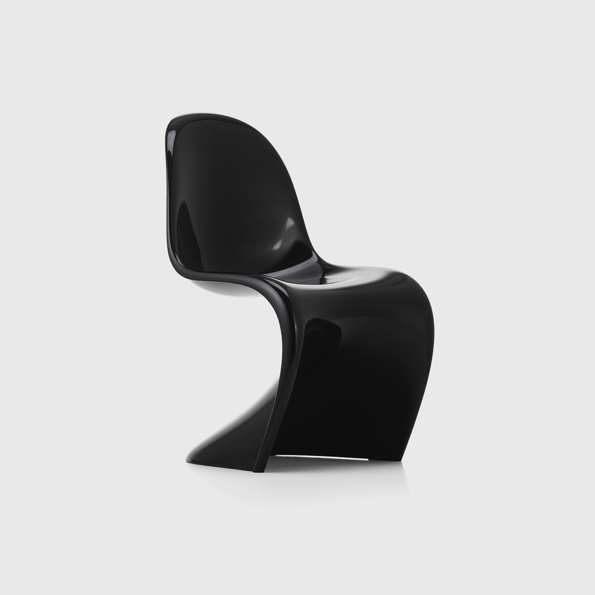
Panton Chair
- Type
- Cantilevered single-piece chair
- Material
- Moulded plastic, glossy lacquer
- Designer
- Verner Panton
- Maker
- Vitra (1967)
How would you describe the Panton chair?
Honestly, I am not a major fan of the Panton chair, simply because I find plastic moulded furniture outdated and very cheap. It reminds me of something you would see at IKEA in the kids section. But researching into the behind the scenes of this design, the use of a cantilever design embracing the suspension for a more comfortable and fluid feeling is great design behaviour.
Who was it designed for?
This chair was designed to be easily mass produced for a large demographic, not as an art piece but rather something everyone has and can get their hands on.
Who designed it?
Designed by Verner Panton.
Which is your favourite Panton chair colour? Why?
I am not a major fan of bold colours in furniture, as that environmental aesthetic doesn't appeal to me; I like very neutral and simple colours. I would say the black version, as it feels strong and luxurious in a white environment. My colour language is very dependent on the environment around it.
Re-colour to Re-feel
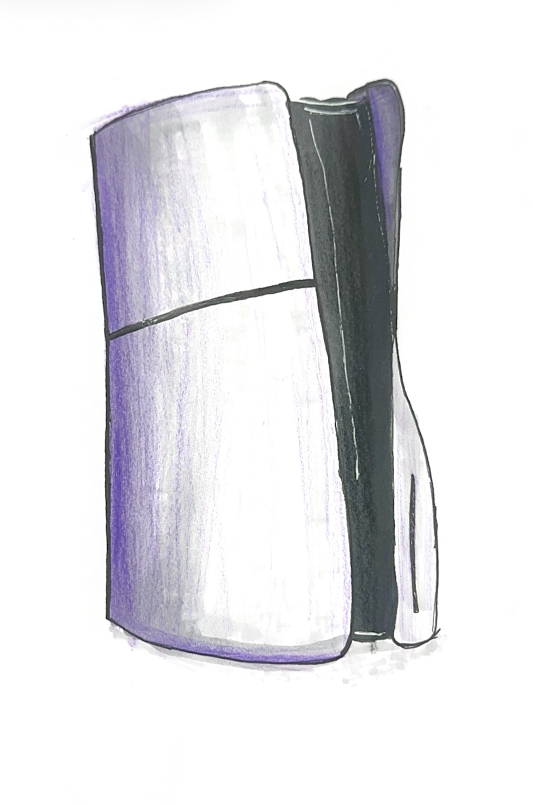
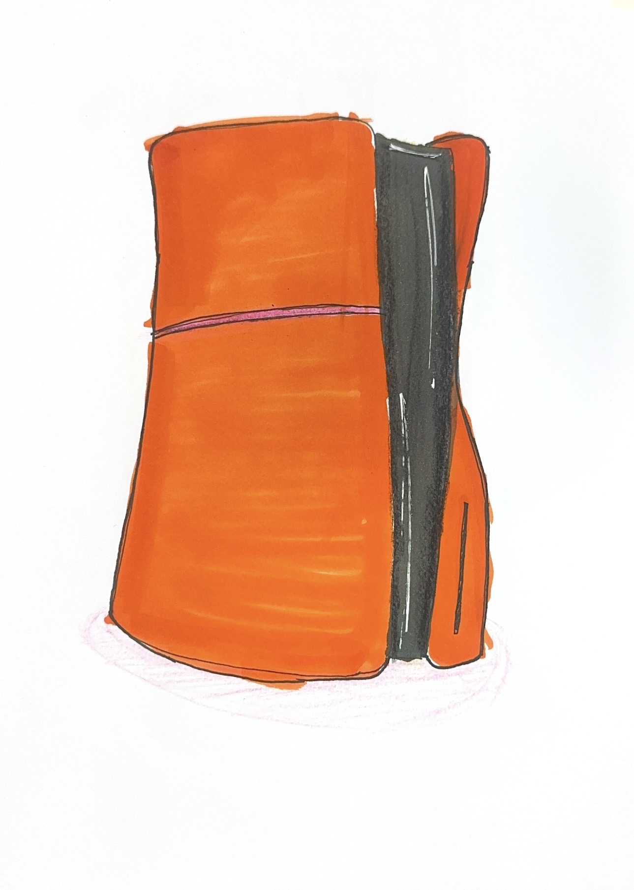
Exploring how colour influences emotional perception by recolouring a single everyday object into three variants — its original scheme, one tuned for calmness, and one tuned for excitement or urgency.
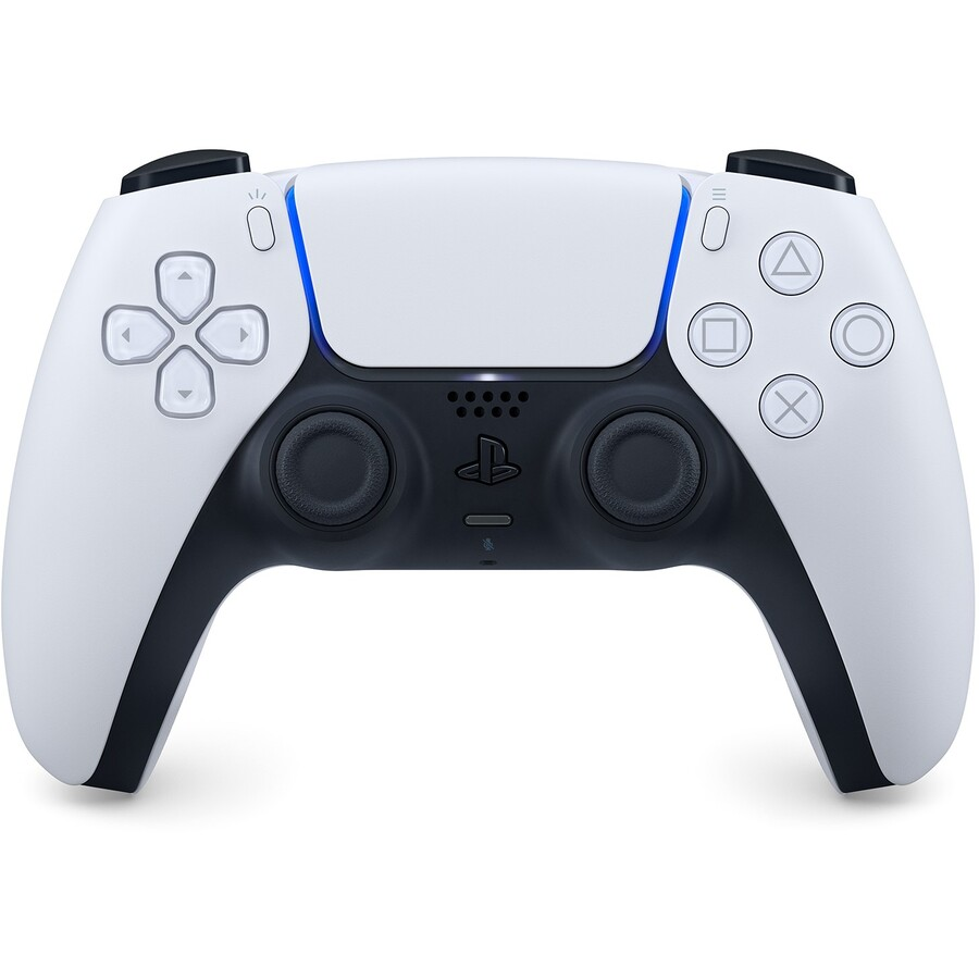
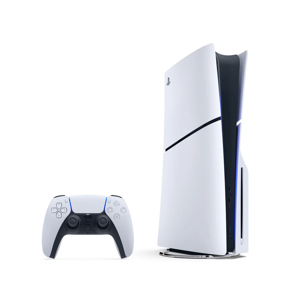
Object: PlayStation 5 (PS5)
The PS5 recoloured across three emotional schemes.
Re-colour to Re-feel: Tool & Torch
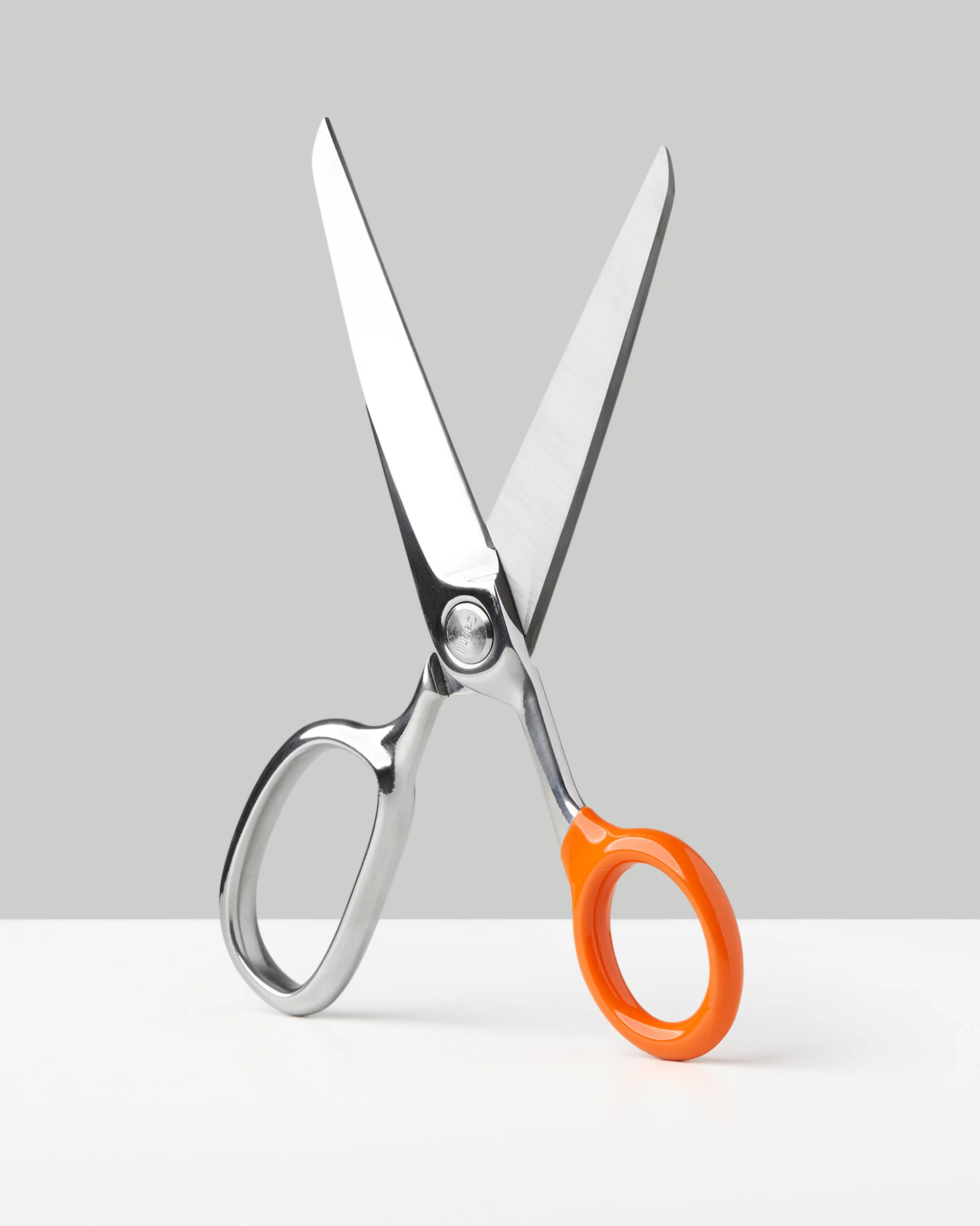
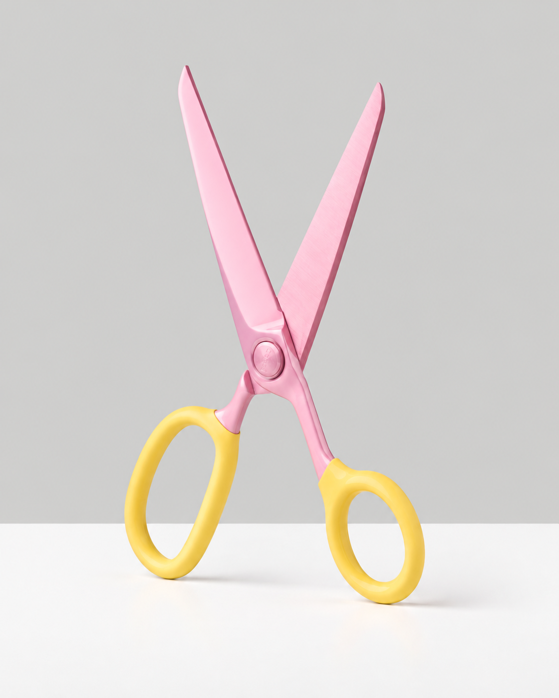
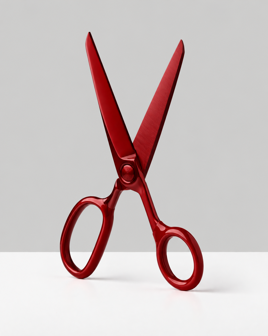
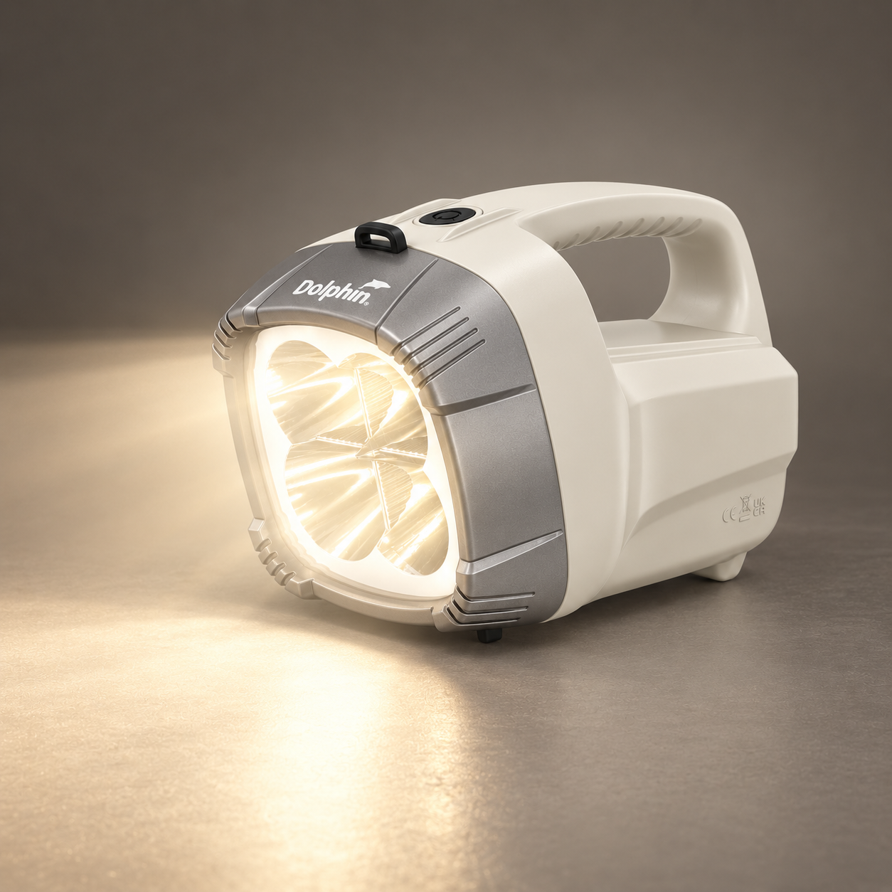
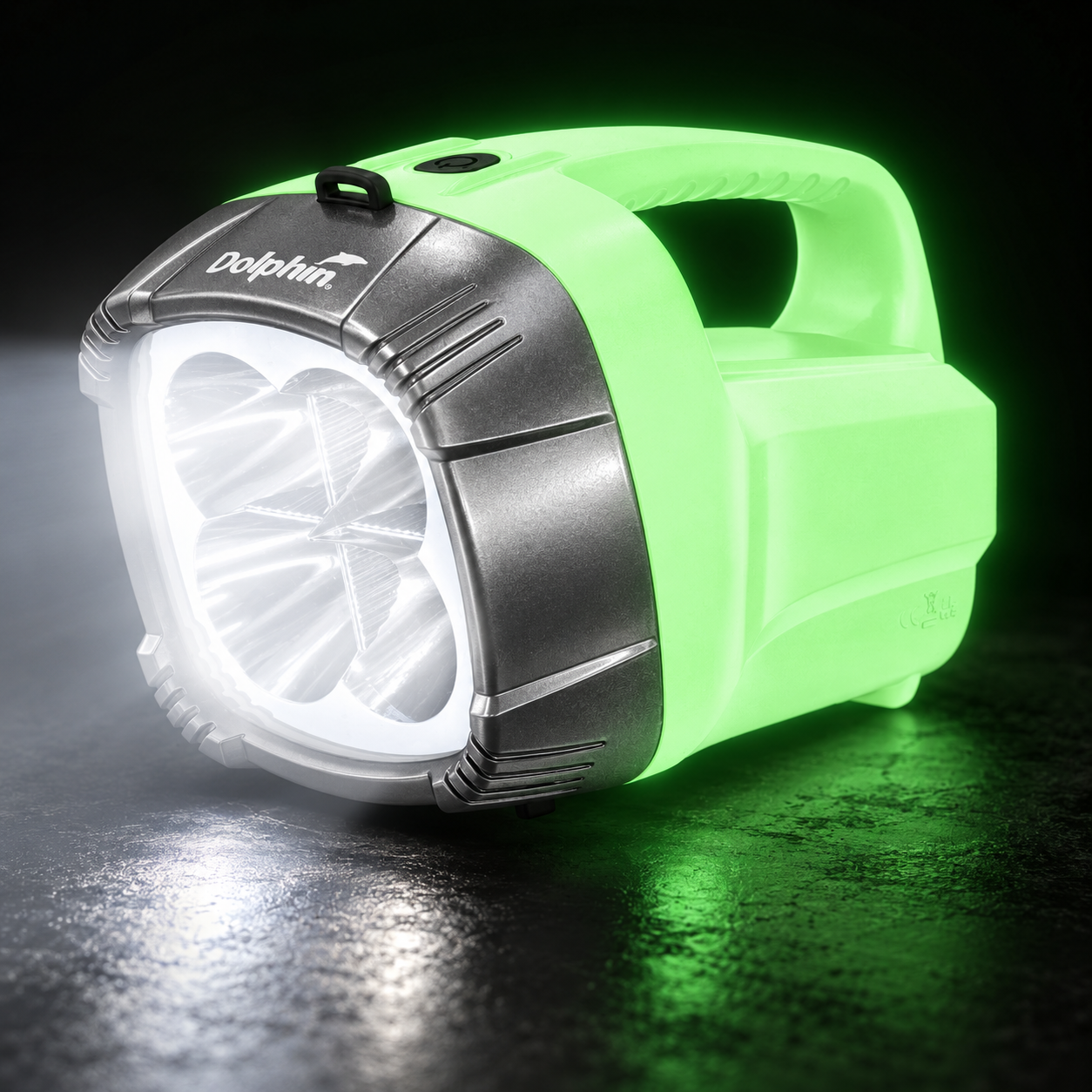
Applying emotional recolouring to a hand-held tool and a torch — each rendered in three schemes (original, calm, and excited or urgent) to explore contrast, saturation and cultural colour meaning.
Hand-Held Tool: Craighill Chroma Scissors
Torch: Dolphin Torch
Colour Reflections
In the "Emotion Through Colour" activity, which colours most changed the object's emotional tone, and why did those hues affect perception so strongly?
When going from a neutral, monochromatic colour like white, off-white, black or grey, which have very muted tones, then converting that to a very heavy colour like bright orange or solid blue, the product goes from little emotion to a massive 'in your face' feeling. Depending on the colour, something like orange makes you feel very alert, as if the product is jumping at you, but light pinks really feel chill, calm and dainty.
What did the Panton Chair reveal about colour's role in product identity?
The Panton Chair, being a very simple single-mould product with not a lot of detail to its body, relies on other design elements to stand out. Implementing a range of colours helps develop that idea within this product, and additionally I found it releases personality into environments. If you have just one single chair as a feature piece in an environment, you may give it a strong and vibrant colour, however if you have many and don't want to overcrowd a space, give it a more neutral, low-tone colourway to help the form stand out.
What challenges came from balancing emotional expression with usability, and how will you navigate this in your torch's colour choices?
For me, colour doesn't impact usability, however one thing that came to mind when you compare torch and colour is the difference in the colour of light that the beam can emit. So I would say no impact from the actual colour of the torch's body, however yes, it can impact significantly the colour of light being emitted. I found, looking around my home, some bulbs are very dull and yellow, whereas new lights are white and strong. This really affects the way I feel too. If the torch is for environmental use, like being a nice emotional light, then maybe go for a warm yellow, but if it's for practicality, go for a pure, strong white.
Week 4 Form & Semiotics
Semiotics + meaning
Understanding semiotics
After watching the video "What is Semiotics?" by Occam's Answers to give me a definition on exactly what semiotics means, I have become familiar with and do understand the concept. The examples provided in the video are strong, like the save icon or the hamburger icon, because those I actually do correlate to, and when you actually compare the image to the icon, it is crazy how much story and meaning it gives to users.
Importance to industrial design
My next thought process was that this key concept is very graphical, and relies on images most importantly to actually convey the ideas. So then I go 'how does this link to product design?'. This is something I want to develop more ideas around, because currently I cannot see it working in products other than small embossed images, like the oil icon on my dipstick in my car, or the power icon on a remote, because technically it is still a graphical perspective just implemented into the product design realm.
Snoopy Lamp Reflection
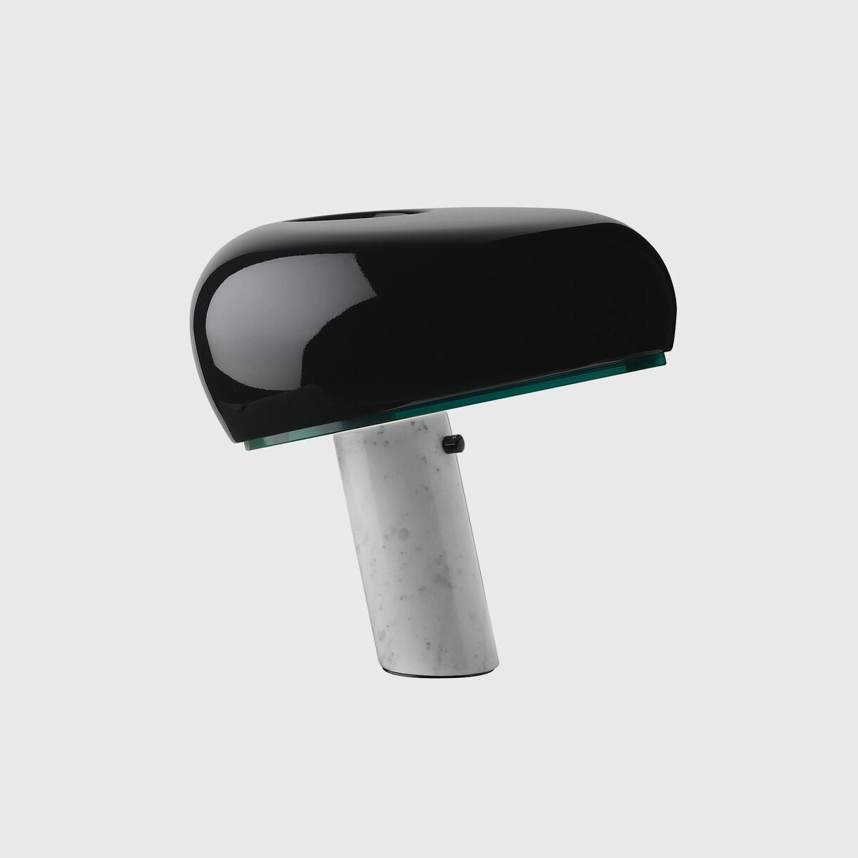
Snoopy Table Lamp
- Type
- Table lamp
- Material
- Enamelled metal, Carrara marble base
- Designer
- Achille & Pier Giacomo Castiglioni
- Maker
- Flos (1967)
How would you describe Castiglioni's "Snoopy" with reference to the topic?
I would describe the Snoopy lamp as a luxury product that utilises form as its strength. When talking about materials, because this isn't a handheld product, the use of the reflective top dome is great, because as I mentioned earlier, this material finish on handheld products does show fingermarks.
Can products have personality?
Products can certainly have personality due to the way they sit in an environment. The lean on this product really captures personality, and pairing this reflection question to this product is a good way to first start seeing personality in design. I can compare this to my digital design of my own logo; I see it having a personality to it in terms of being joyful and waving at the viewer. Then you look at this lamp and it looks calm and relaxed, due to it leaning like a 'cool', relaxed person would on a wall.
Who designed it, and who was it designed for? (company)
Designed for Flos by the Italian brothers Achille and Pier Giacomo Castiglioni.
Form Speaks: Designing with Meaning
Exploring how form communicates symbolic meaning and function through semiotic principles in product design.
Object Analysis
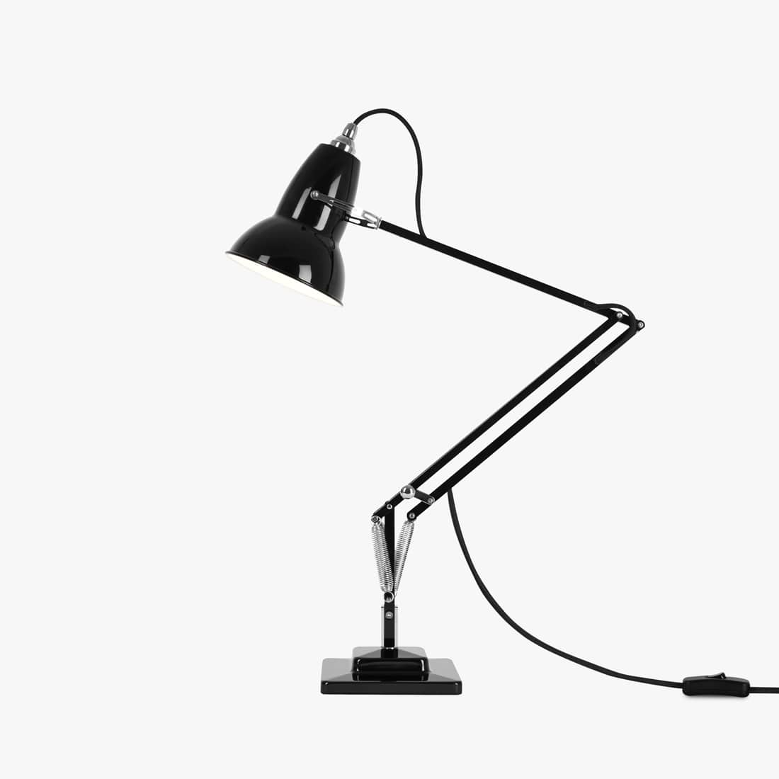
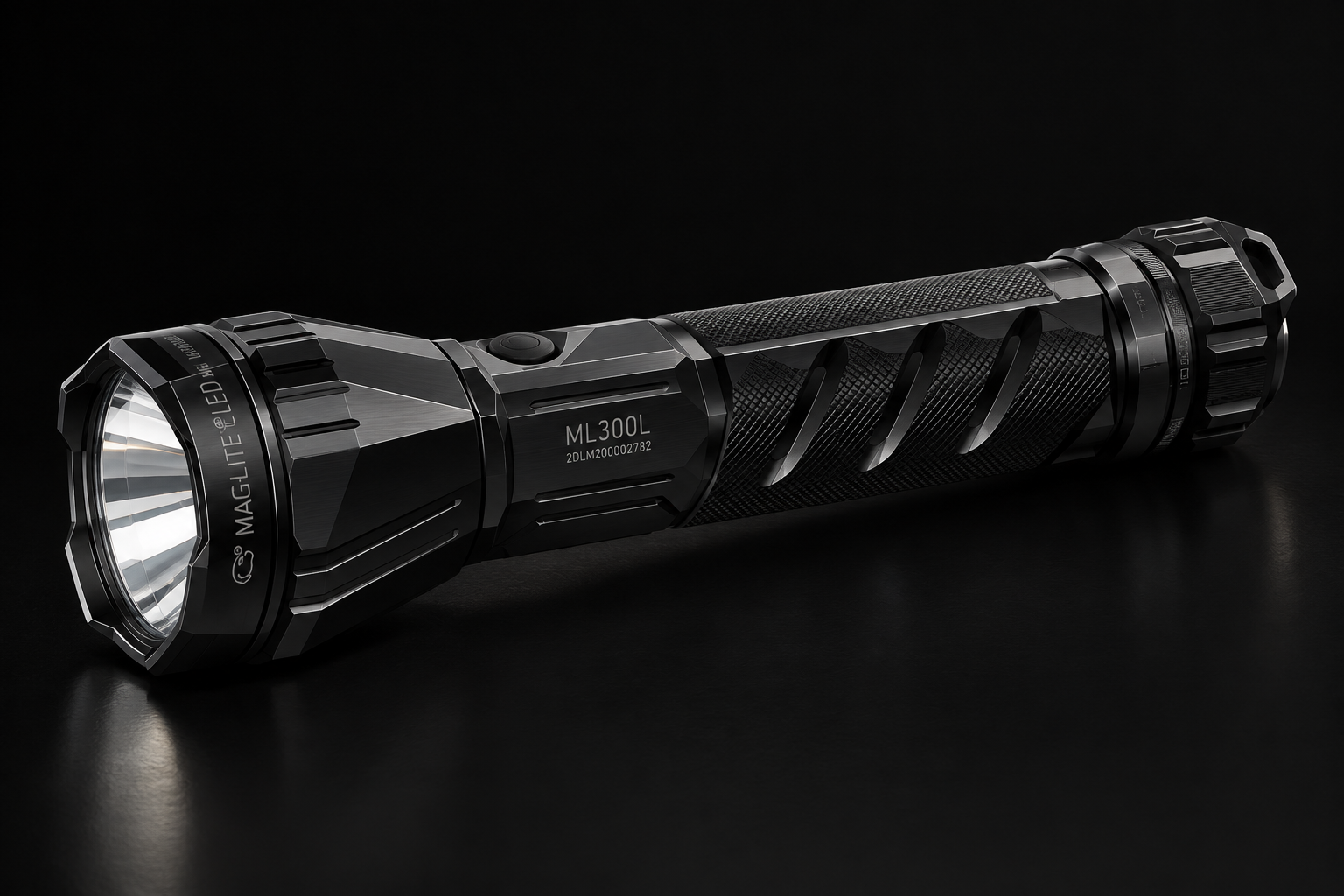
Due to time restraints I was unable to produce these redesign ideas using traditional sketching tools, so I used rapid AI prototyping tools instead. These were still helpful in conveying my strong ideas, just in a quicker time.
Re-Design
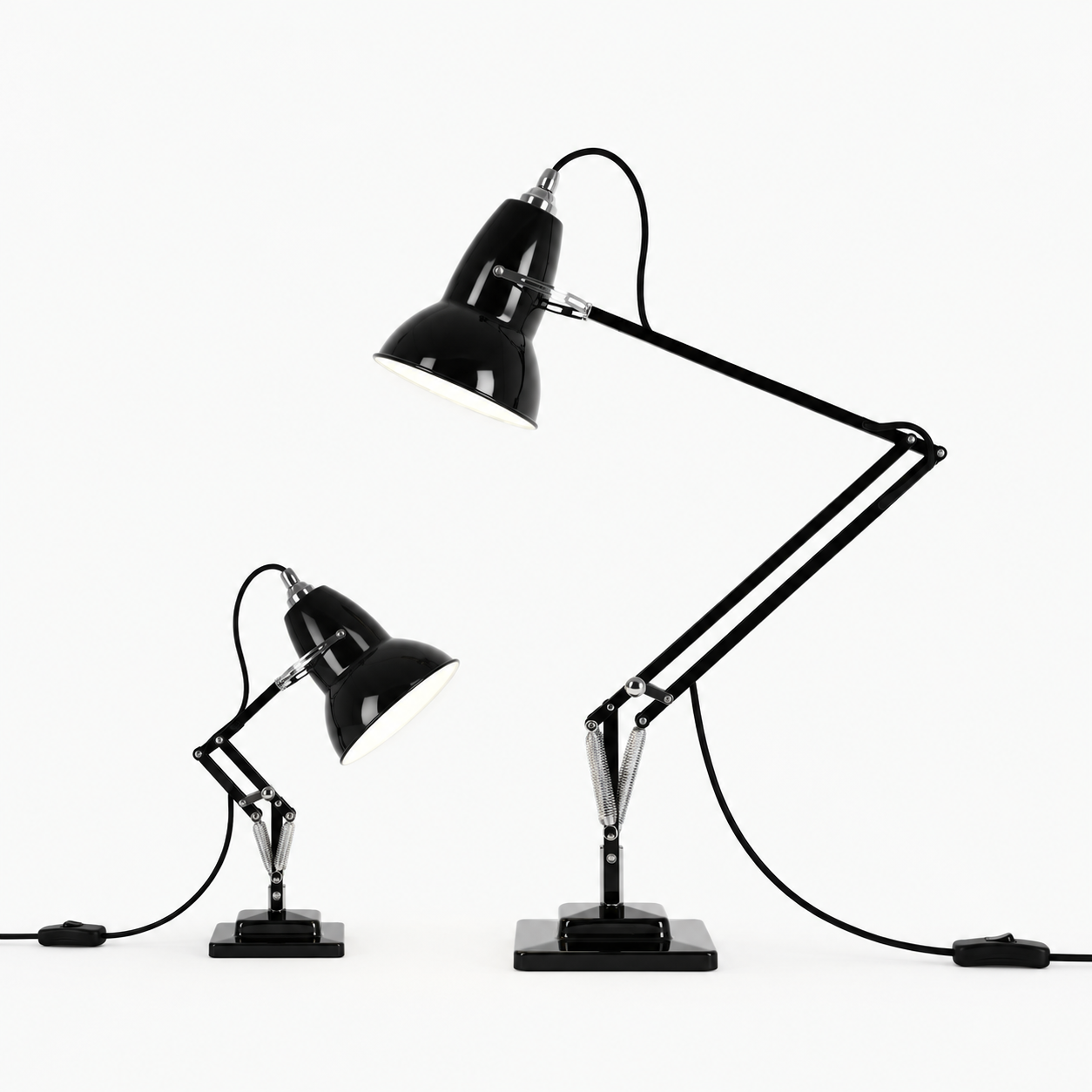
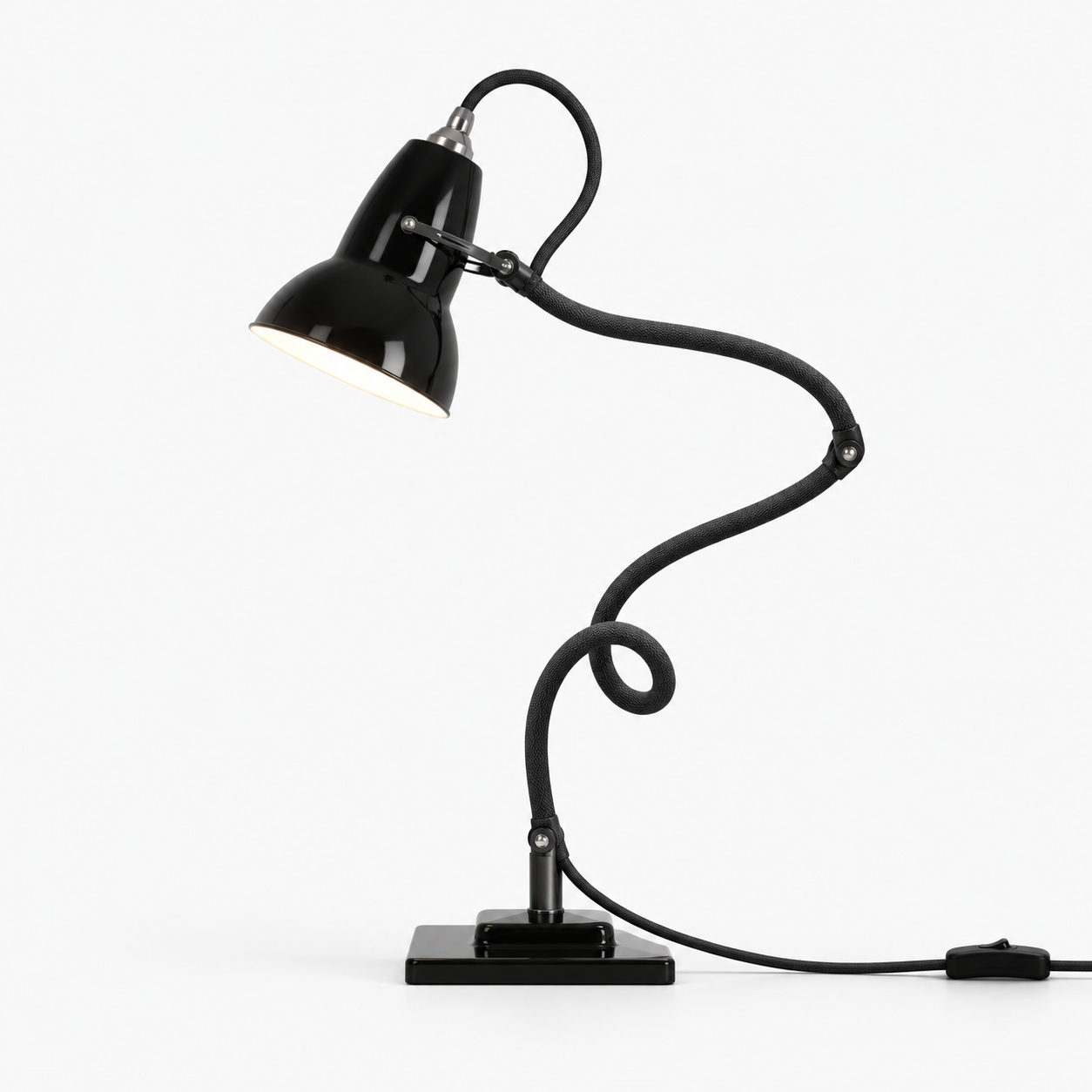
Form Speaks: Designing with Meaning for Hand-held Tools and Torches
Exploring how form communicates symbolic meaning and function through semiotic principles in the design of hand-held tools and torches.
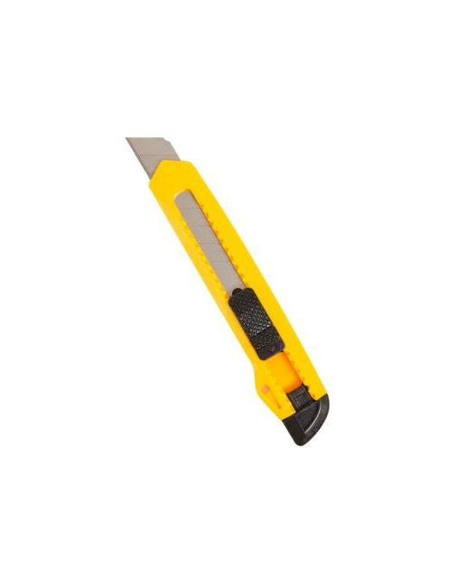
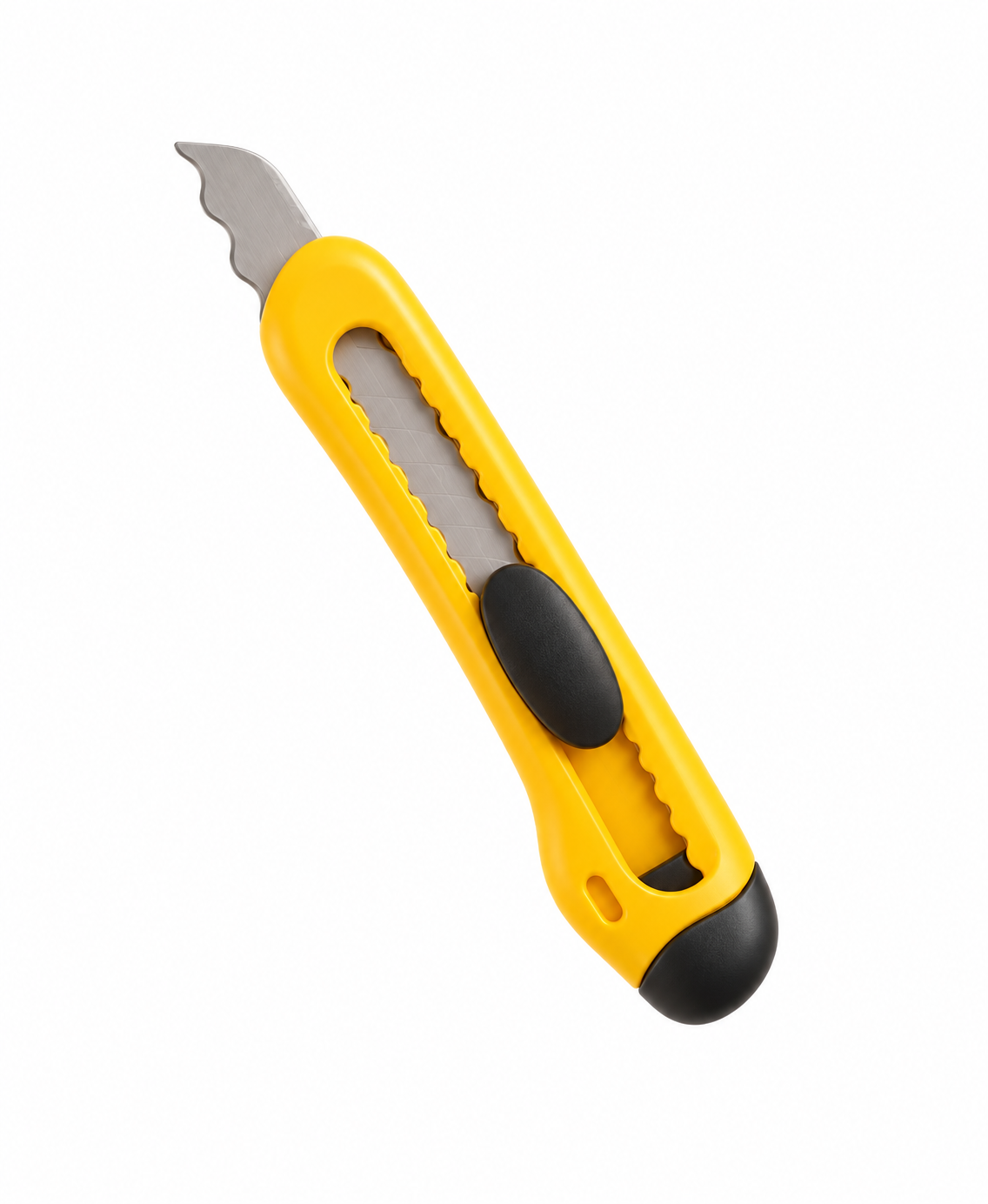
Hand-Held Tool Analysis
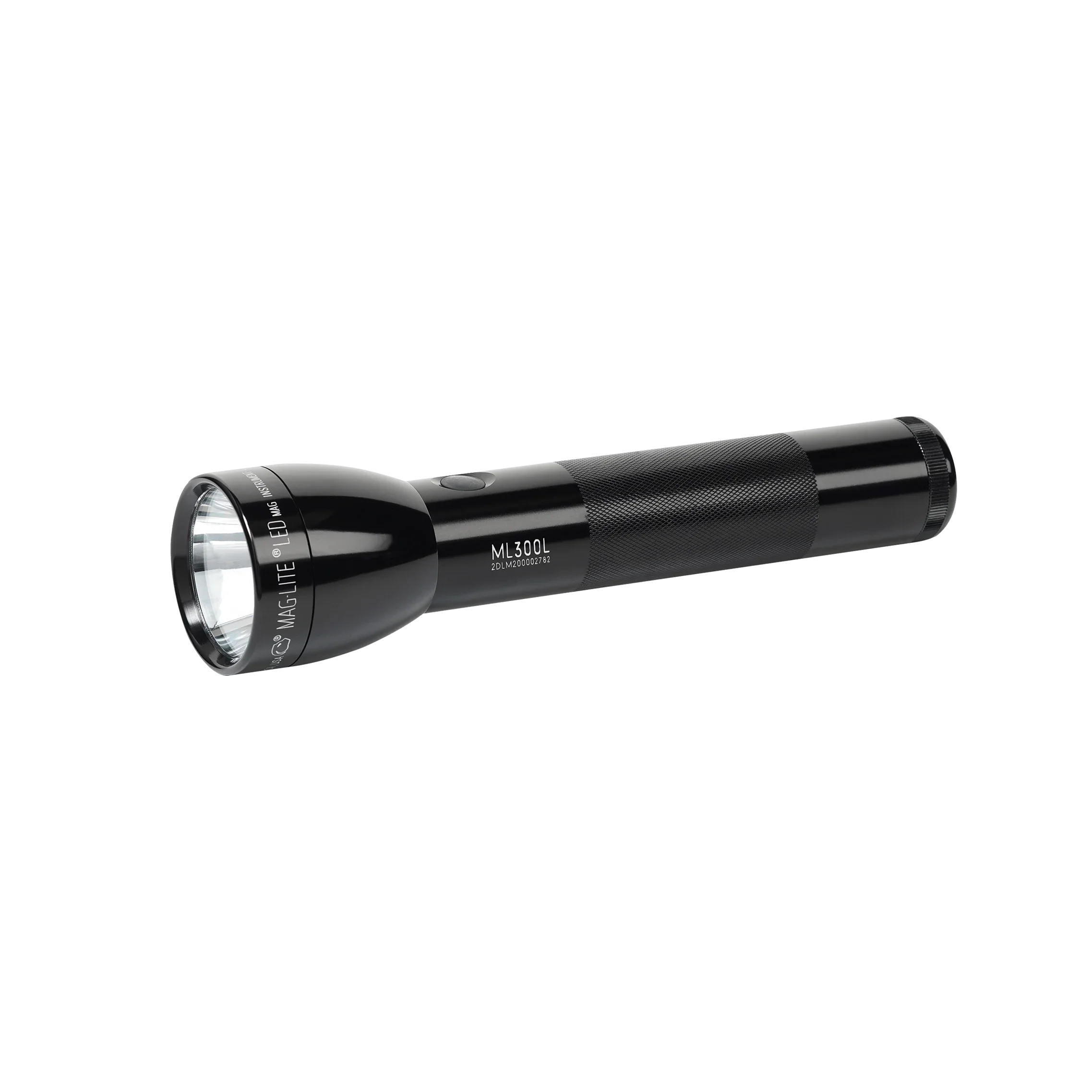
Torch Analysis
Re-Design
Semiotics Reflections
Which forms and shapes communicated a clear message, and what cultural associations shaped how you read them?
The clearest one for me was the Maglite. Its basic handle and bulb shape instantly reads as 'torch' no matter the colour or detail, almost like a 2D graphic. The biggest cultural association I noticed was with the Anglepoise lamp, I read its big shade as a friendly, alive eye purely because of Pixar's branding, an association that wouldn't have existed when the lamp first released in 1935.
On the tools and torches, which symbolic cues (colour, form, proportion, detail) signalled their use, and how might that differ across cultures?
On the knife the sharp pointed end, exposed blade and even the yellow body all signal caution and 'cut', yellow being a warning colour.
How did cultural and social context shape your symbolic choices when redesigning a tool, and how could that guide design for diverse users?
When I redesigned the knife I went super bubbly and rounded so it felt calming and safe, softening every hard edge so someone could pick it up without fear. That choice was all about reassurance, which could guide designing for nervous users, kids or anyone who finds tools intimidating.
Which semiotic choices best communicated purpose or emotion, and how could you refine them so your torch reads clearly to everyone?
The simple, basic torch silhouette communicated purpose best, the handle and bulb combo is so easy to understand that anyone reads it as a torch straight away.