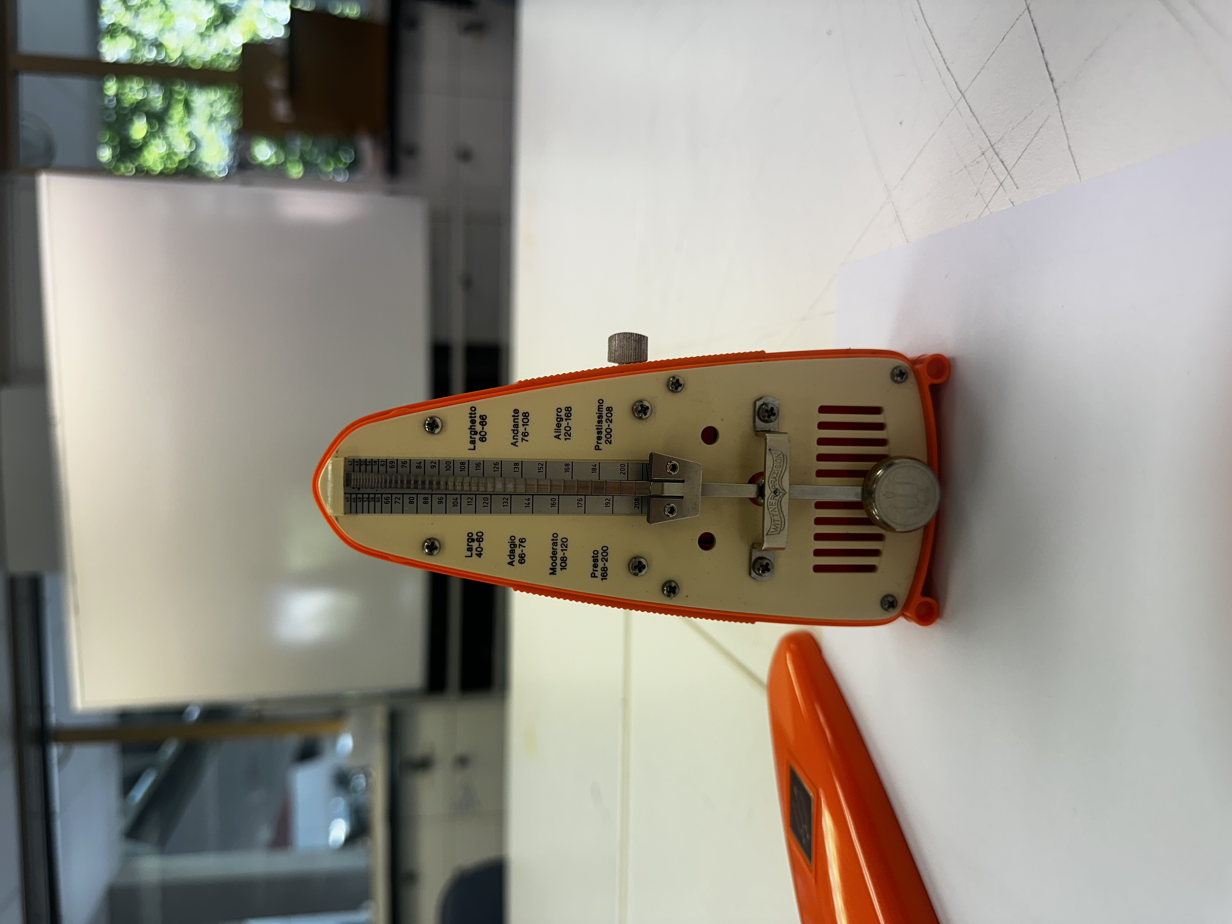
01 / Lines On Lines

Lines On Lines

Using only lines, I was tasked with creating 6 images, each one representing a different element or principle of design.

Emphasis

  • Line weight to show the prominent line
  • Diamond shape conveys three dimensions and looks like the emphasis is closer to the viewport

Rhythm

  • 5 Lines follow a path
  • Path beats like a heart monitor
  • Darker lines of the left with lighter lines on the left, help shows a fading rhythmic sound

Harmony

  • The most recognisable harmonic form in the world is a hand
  • Similarly, the hand is bound with five lines
  • The had is also a symbol for harmony day

Chaos

  • In a non chaotic world, the 5 dots on the left join in parallel with the 5 dots on the right
  • In a chaotic world, no path is predictable
  • Crossing lines in non symmetric places triggers OCD which suggests chaotic symptoms

Motion

  • Flow of falling dominoes
  • lines falling pushing in the easterly direction

Stasis

  • Stasis is to convey stillness
  • Rocks are the simple for strong, stable, and grounded
  • Lines stacked like a tower of rocks, with heavy ones at the bottom and lighter weights at the top, hence the corresponding line weights
02 / Product Observations

Product Observations

For this activity I chose 5 objects to sketch and observe, noting the design elements and principles present in each one.

Object 01

Retro Metronome

Wittner [Germany]

Elements

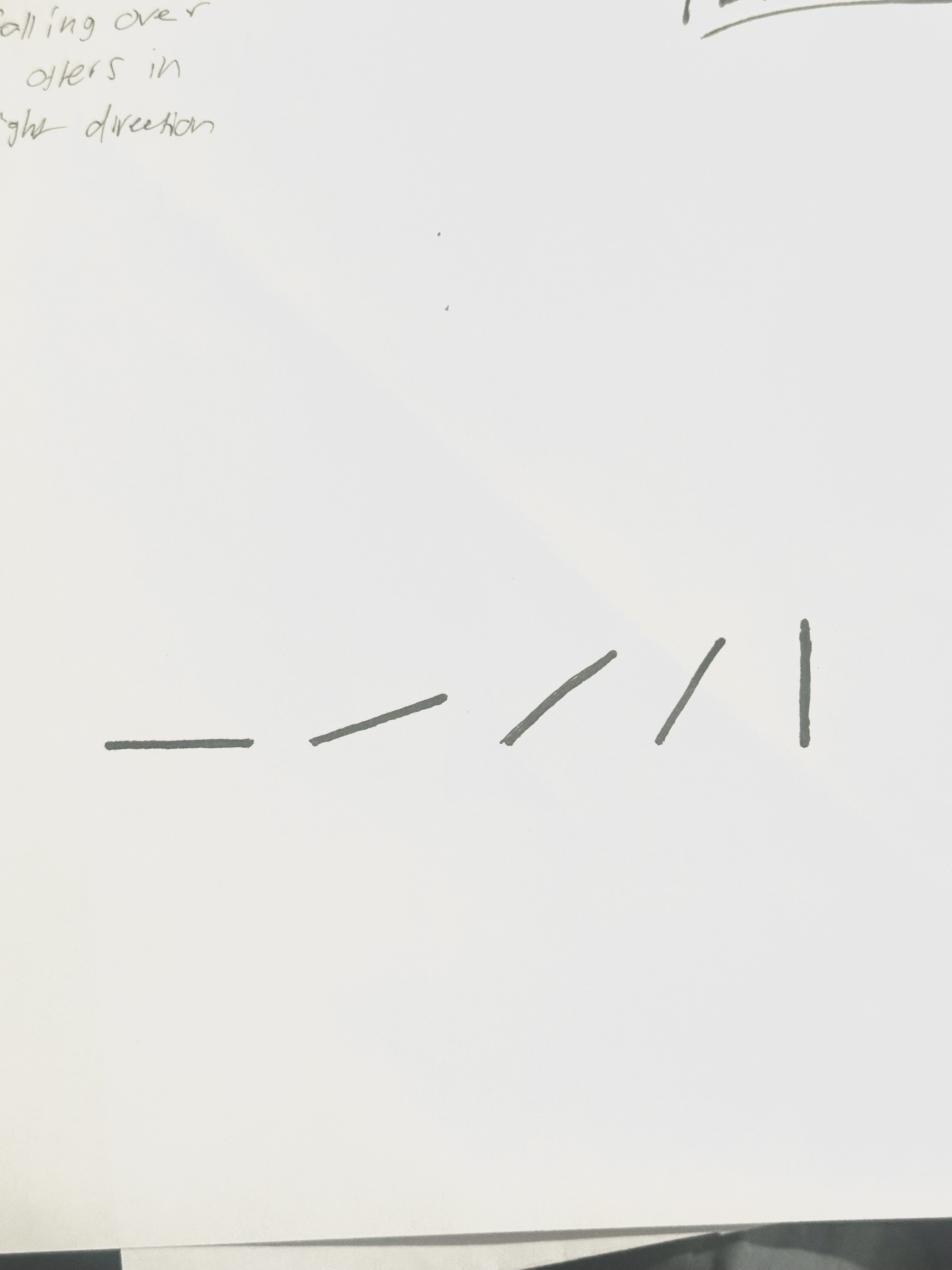
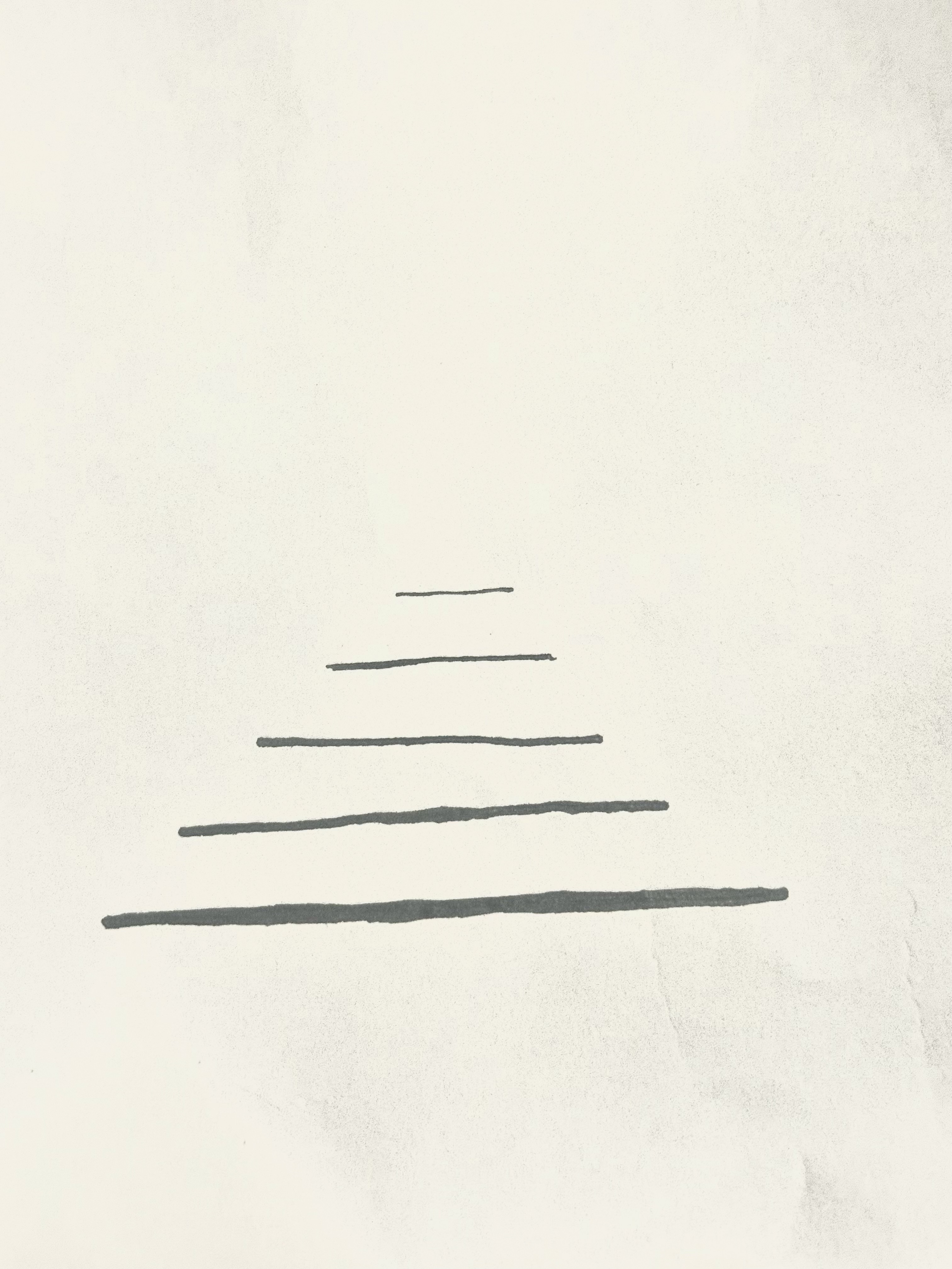
  • Textured embossed lines for grip when holding the object.
  • Setback lip around the outer edge of the form to allow the lid to sit flush.

Principles

  • Contrasting bright orange against pale cream to highlight the outer vs inner shells.
  • All features such as screws, printed text, metal parts, and extruded lines, are all symmetrically balanced.
Object 02

MOKA

Alessandro Mendini

Elements

  • Unique tiered form of sphere like shapes which creates internal volume.

Principles

  • Black components emphasis where the use is meant to touch the product.
  • The kettle is unbalanced on purpose so it feels heavier on the handle side, this prevents the user from overspilling.
  • The empty space between the vertical part of the handle and the main body, allows room for fingers to reach under and grip the object.
Object 03

SHARPLE

Dreamfarm

Elements

  • Distinctive point on the right side to convey where to hang the tool on a hook.
  • Sharp 45 degree point at the end of the form for digging into foods.

Principles

  • The lip around the internal plastic form provokes movement for the transparent plastic cover.
  • Clear casing helps emphasis where the metal blade component is, adding more safety.
Object 04

Red Flower Teapot

Kaj Frank

Elements

  • The use of dots in the patterns for a visual aesthetic.
  • Form of the spout mimics the look of nature, the elephant's trunk.

Principles

  • The pattern is symmetrically placed around the entire curved form.
  • Spout conveys movement through its fluid curved form, showing where the internal liquid is released.
Object 05

OZITO Drill

Elements

  • Internally extruded lines on the handle apply texture for better grip.
  • Lines on components for a place to touch and hold firmly, including, chuck, handle, battery, dial.

Principles

  • Red components emphasis where the use buttons are.
  • The use of a sturdy base and geometrically-weighted top allows for the drill to have a strong balance when in rest.
Object 06

Eclipse Lamp

Elements

  • Circular shapes joint together to make the form
  • The lines that make up the silhouette of the object and its interior lights are very prominent due to the shape and curves.

Principles

  • Warm light contrasts from the cool off white plastic form
  • Black dial is emphasised and filled with line texture for ergonomics
03 / Gestalt Die Cuts

Gestalt Die Cuts

This activity involved cutting shapes from black paper and arranging them to demonstrate Gestalt principles of visual perception.

The aim was to produce 5 die cut artworks, however, the artworks had to follow the design principle of repetition. Additionally I challenged myself to always link back my choices to gestult theory and the principles. My peronal princaple was to follow the veiw of ever day life rather than abstract patterns.

Drop image at /images/sketch-gestalt-keyboard.jpg

The Apple Keyboard

One of the repeated sequences used by people every day, some may recognise the different rectangular shapes and which key they correspond to.

I sketched this pattern on an angle to the perimeter, which helps give more visual character and helps distinguish it from brick and grid like patterns.

Gestalt Principle: Figure and ground - The large cut out triangle distinguishes where the background is contrasted to the edge of the laptop.

Drop image at /images/sketch-gestalt-novel.jpg

The Novel

No matter what book it is, the art of compressed pages bound together with a spine depicts repetition. This is one of the more recognisable uses of repetition in life but being gestalt, it might take the viewer some time to understand what it is without shading, colour or imagery.

Gestalt Principle: Closure - the lines only guide your brain to see the 3D picture derived from lines bent at an angle.

Drop image at /images/sketch-gestalt-rain.jpg

Rain

One of my more simple gestalt die cuts, however, it does not lack design principles. The chaos of randomly placed rain droplets, the contrast of background to droplet, the empty space between each droplet, and finally size is evident in each droplet which shows the distance the object is from the viewport.

Design Principle: Similarity/Figure and Ground - Using similar shapes all with different sizes helps show the brain that its looking into a field of rain; the size helps show figure and ground, depicting that there's rain far from the viewport in a 3D environment background.

Drop image at /images/sketch-gestalt-endgrain.jpg

Trunk Endgrain

One of my most difficult die cuts. The thin lines held together with little white tabs. This repetition is found in nature's main element, the tree.

Drop image at /images/sketch-gestalt-coral.jpg

Brain Coral

This is one of my more abstract patterns, however, it is still follows my personal principle of everyday life, since this pattern is home to the oceans coral. Brain coral is very popular amongst reefs and its pattern follows repetition, but also a bit of chaos due to not having any symmetry with the lines.

Gestalt Principle: Continuation - The flow of many curved paths allows the brain to look deeply into the artwork.

Drop image at /images/sketch-gestalt-line-cutting.jpg

Line & Cutting Practice

This repetitive artwork was done to practice my line sketching, ensuring there paralel, as well as learning to use a scalpel to cut such tedious lines.

The 5 artworks were chosen from my ideation page. This page is composed of 15 thumbnail drawings, each one being a rough sketch to throwdown ideas and not focus on detail or perfectionism. My ideations are mostly choices seen in everyday life, rather than abstract artworks with hidden meanings; I wanted my diecuts to be easily recognised but also have some thought time where the veiwer tries to figure out what they are looking at.

04 / Line Study

Line Study

Using 6 objects found around my home, I studied the line work that builds the object, focusing on primary, secondary and tertiary lines. You will find a key which explains the meaning behind the colors.

Key Primary Secondary Tertiary
Drop image at /images/sketch-line-mouse.jpg

Logitech Mouse

Due to its low linearity and strong curvature, there are not a large quantity of lines evident in the form. However I was able to find lines in its break between materials and components, like the gap between the base and buttons having this strong linear gap. Furthermore, the scroll wheel component differs from the main body which creates line separation which is highlighted in secondary lines.

Additionally a repetition of lines along the side of the base used for grip and detail on the form is an evident use of contour lines. These lines are not strongly evident in the form but are details which expresses them as harmonious contour lines.

I found it interesting that even in such a curved form, so many lines can be discovered. Movement is true in this design as I visualise curvature in lineworks to express the principal; different to straight angular lines which don't convey this principle as strong.

Drop image at /images/sketch-line-clase-azul.jpg

Clase Azul Bottle

The bottle was hard to express in line form due to its low emphasis on components and angular form. I opted to focusing on its pattern as part of the product which helped me emphasis more contour lines on the product.

Secondary lines were the least prominent within the design as there only one separation between components (lid and body). Contour lines were also discovered within the main molded form where the body transitions from one size to another.

Drop image at /images/sketch-line-ugg.jpg

UGG Boot

The ugg boot emphasises on transitions between shapes which is visually captured by stitch lines. This helps when analysing lines as these stitch lines allowed me to find where mian contour lines would move across the model.

Secondary lines are strong around material transitions, like the linear transition between foam sole and leather body. Furthermore the rim around the opening of the hole is another material transition from lather to fluff which explores secondary lines.

Drop image at /images/sketch-line-ps5.jpg

Playstation 5

Similar to the Logitech Mouse, the strong curvature in the form reduces the amount of visual lineswork. Linework is most prominently evident between material transitions, gaps, and edges of components.

I enjoyed expressing contour lines in the model as the bends in the modeled plastic truly express strong contour lines.

There is strong symmetry in this model, apart from the disc drive on the side. Symmetry is expressed in the linework as on both sides there is a gap between panels which depict the edges of components and again show secondary lines in the product.

Drop image at /images/sketch-line-side-table.jpg

Side Table

This highly angular product was great to analyse linework, mainly because of its sharp edges and multiple component transitions.

Where secondary lines thought to go within this model, I sketched them as contour lines as each edge was filleted with a curved surface hence it's more of a non visible transition and only evident through contour.

There is a bold lip around the top surface of the tabletop which is expressed as secondary.

Drop image at /images/sketch-line-controller.jpg

Gaming Controler

This object was the most emphasised way to convey line work within a model. The composition between materials and molded plates creates visual and strong linework for interest and design purpose.

the joysticks could be seen as a primary silhouette from another angle but I chose to sketch them as secondary as they share the same emphasis as the buttons, hence they become secondary.

05 / Logo — Shape Interrelationships

Logo — Shape Interrelationships

Developing a personal logo monogram using the principles of shape interrelationship — exploring how two letterforms can interact spatially to create a unified mark.

When developing a logo for my personal website, I discovered the relationship two of my initial characters could have, that being the J and A. I found this activity interesting as logo development is something I appreciate in life, and forming an understanding for how that creation comes to life is something of importance to me.

To find an interrelationship between the two characters I followed relationship principles, these being, Touching, Overlap, Union, Detachment, Subtraction, Intersection, Coinciding, and Interpenetration. Overall, I used an ideation process where I cut out my initials on paper and moved them in ways to create interrelationships that follow the principles.

My best work was evident when exploring the principles, Touching, Union, and Overlapping, as these all developed logos that looked like they could work when taken digitally.

I found detachment felt to weak as a design as there was no strong interrelationship and the logo felt out of place due to the spaced letters. Additionally the spacing removed the harmony between the characters.

In the polishing stage of the logo creation I followed some of the more complex interrelationships where I developed an idea for subtraction using a previous logo generated with overlapping. The overlapping was simply subtracted leaving a two-tone logo.

However this logo felt to bold and complex, making it to harsh on the eye, therefore I opted to the second design.

The second design was my favourie as I love the way two shapes can morph into one but still convey there individual traits. The J is still evident inside the A which helps portray what my initials are. Furthermore, unlike previous ideations, the J is on the left hand side proving that my initials are JA not AJ.

I additionally like the movement this logo depicts from the transition from curved J into the body of the A.

← Back to University Studies